| Name | Version | License | Source | Languages | Author | Icon | ||
|---|---|---|---|---|---|---|---|---|
| Main elements library of the user interface | 2.3 | GPLv2 | vcaBase.db (SQL, GZip) > VCA.wlb_Main | en, uk, ru | Roman Savochenko Maxim Lysenko (2011-2012) — the page initial translation |

| ||
| Description | ||||||||
Provides the library of the main elements of the user interface of common and the industrial automation.
| ||||||||
The library is created to provide main elements of the user interface and it contains graphic elements, often need when forming the user interface of the automation of technological and common processes. The library is built on the basis primitives of the widgets and the internal programming language JavaLikeCalc.
The element's names and their parameters are available in languages: English, Ukrainian and mRussian. Their source code wrote in the human-language independent mode with calls for the translations by the function tr() and the message's translation also allowed for English, Ukrainian and mRussian.
For connection the library to a project of the OpenSCADA station you can obtain the database file as:
- supplied with a ready and proper package of the Linux distribution like to "openscada-libdb-vca", "openscada-LibDB.VCA";
- directly taken for most actual one from the subversion repository and converted to the DB SQLite file in the way:
wget http://oscada.org/svn/trunk/OpenSCADA/data/LibsDB/vcaBase.sql
sqlite3 -init vcaBase.sql vcaBase.db .exit
- downloaded for the one attached here.
This obtained file next you can place into the project directory of the station and create the database object for the DB module "SQLite", registering the database file in the configuration.
Contents
- 1 Widgets — graphical elements
- 2 Root page (SO) (RootPgSo)
- 3 Main frames
- 3.1 Graphics group (grpGraph); Graphics group 10 (grpGraph10)
- 3.2 Contours group (grpCadr)
- 3.3 Group of overview frames (ViewCadr)
- 3.4 Result graphics (ResultGraph)
- 3.5 Regulator's control panel (cntrRegul)
- 3.6 Alarms — state (alarmsSt)
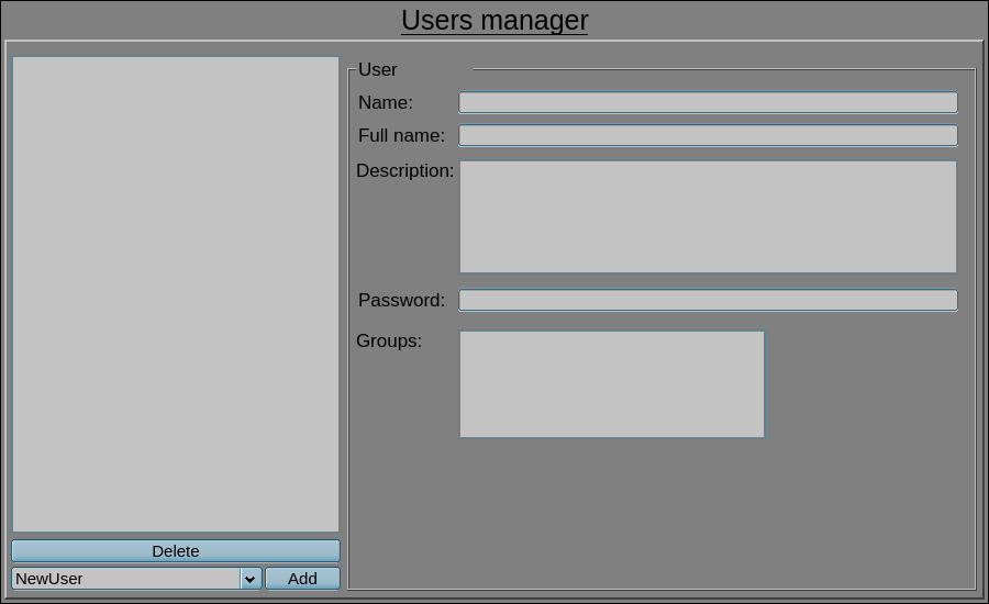
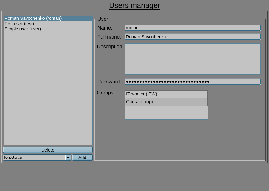
- 3.7 Users manager (userManager)
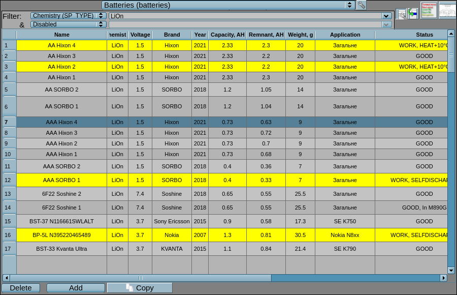
- 3.8 Storehouse (storeHouse)
- 3.9 Dynamic frame (dynFrame)
- 4 Control panels and simple dialogs
1 Widgets — graphical elements
Contains general-purpose widgets that are intended to be placed on the main frames. These main frames can also be frames outside of this concept of the signal objects of the root page "RootPgSo", but it should be taken in account that they often refer to and call certain control panels!
1.1 Analog show (anShow) |
1.3 | GPLv2 | * | en, uk, ru | Roman Savochenko | -1 ms (parent) |
The element on Figure 1.1 is used to display the current value of the analog parameter and the regulator mode, if the parameter is a regulator. Also this element generates notifications of violations on the corresponding parameter settings. The element commonly uses and represents the representative structure of the "Analog signal" DAQ-template.
Using — development
This widget can be used by the developer to create mnemonic schemes with displaying of values of the analog parameters and PID-regulators. To use it you need to add this widget to a mnemonic scheme, adjust for the horizontal, vertical size, by scaling, and link to the data source parameter.
Using — runtime
In the runtime mode, in the main field of the element, there are displayed the parameter name, the regulator mode (only for the regulators) and the current value-variable of this parameter; which, depending on the presence of a violation, are displayed in the color style: labColorGood, labColorWarning, labColorAlarm; and in which value the image of the inquieted parameter may blink. At the hardware errors and non validity the data, the last value is grayed out and crossed out. In the tooltip the user may get the linked parameter description and its errors.
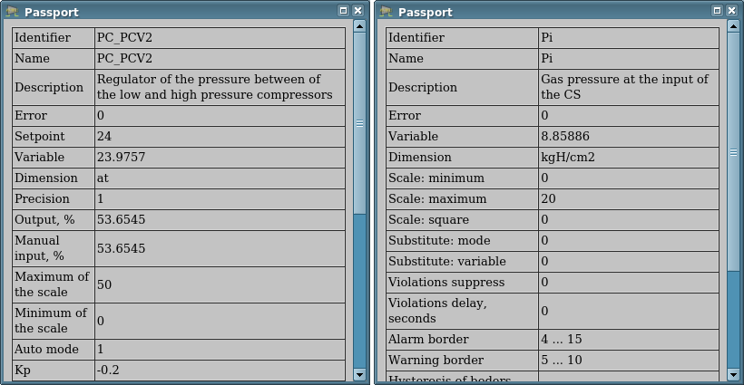
In the active mode of the element you can obtain the parameter passport clicking the right mouse button on the body of the widget. The passport will present all properties of the parameter. Pressing the left mouse button in the widget body will cause to appear in the panels area for control panel of the parameter, and the selection of this widget will be displayed with the blinking frame.
![]() The widget supports now of working with very big "Periodic processing" value and that value is set now to inherit from parent widget/page/session (the value -1). That is possible by a mechanism of the events early processing and the possibility of control the processing periodicity from the procedure.
The widget supports now of working with very big "Periodic processing" value and that value is set now to inherit from parent widget/page/session (the value -1). That is possible by a mechanism of the events early processing and the possibility of control the processing periodicity from the procedure.
Linking and configuring the attributes
| Identifier | Name | Type | Configuration | Configuration template | Description |
|---|---|---|---|---|---|
| pErr | Parameter: error | String | Input link | Parameter|err | Code and text of the parameter error. It is used to generate alarm. The following error codes are processed:
|
| pModeA | Parameter: regulator mode: auto | Boolean | Input link | Parameter|auto | The large letter "A" is displayed on the left when the value checked. |
| pModeC | Parameter: regulator mode: cascade | Boolean | Input link | Parameter|casc | The large letter "C" is displayed on the left when the value checked. |
| pName | Parameter: name | String (translate) | Input link | Parameter|NAME | Short name of the parameter displayed over the value and inserted to the alarm messages. |
| pPrec | Parameter: precision | Integer | Input link | Parameter|prec | Number signs after the dot, for positive values, and precision (signs in whole), for negative, to display the real end variable on the screen. |
| pVal | Parameter: value | Real | Input link | Parameter|var | Engineeric real value of the parameter. |
| redEVAL | Red parameter name in case of failure | Boolean | Constant | By default, the color of the parameter's name for the "failure" state (EVAL value) is gray. But some critical for the process parameters must have the "failure" state displayed with the red parameter's name. | |
| spName | Speech name | String (translate) | Constant | The parameter name for speech synthesis during the formation of alarm messages taking into account accents of words, pauses, etc. Empty value disables the speech notification! |
1.2 Analog show 1 (anShow1); Analog show 1, short (anShow1s) |
1.4 | GPLv2 | * | en, uk, ru | Roman Savochenko | -1 ms (parent) |
The element on Figure 1.2 is used to display the current value of the analog parameter and a short prefix of the measured value type. Also this element generates notifications of violations on the corresponding parameter settings. The element commonly uses and represents the representative structure of the "Analog signal" DAQ-template.
These two elements differ only in their initial horizontal size, that is, the second "Analog show 1, short" is a short version for very short cases and it is directly inherited from the first one.
Using — development
This widget can be used by the developer to create mnemonic schemes with displaying of values of the analog parameters with a prefix and/or as an element of the static screen table. To use it you need to add this widget to a mnemonic scheme, adjust for the horizontal, vertical size, by scaling, and link to the data source parameter.
Using — runtime
In the runtime mode, in the main field of the element, there are displayed the short prefix and the current value-variable of this parameter; which, depending on the presence of a violation, are displayed in the color style: labColorGood, labColorWarning, labColorAlarm; and in which value the image of the inquieted parameter may blink. At the hardware errors and non validity the data, the last value is grayed out and crossed out. In the tooltip the user may get the linked parameter description and its errors.
In the active mode of the element you can obtain the parameter passport clicking the right mouse button on the body of the widget. The passport will present all properties of the parameter. Pressing the left mouse button in the widget body will cause to appear in the panels area for control panel of the parameter, and the selection of this widget will be displayed with the blinking frame.
![]() The widget supports now of working with very big "Periodic processing" value and that value is set now to inherit from parent widget/page/session (the value -1). That is possible by a mechanism of the events early processing and the possibility of control the processing periodicity from the procedure.
The widget supports now of working with very big "Periodic processing" value and that value is set now to inherit from parent widget/page/session (the value -1). That is possible by a mechanism of the events early processing and the possibility of control the processing periodicity from the procedure.
Linking and configuring the attributes
| Identifier | Name | Type | Configuration | Configuration template | Description |
|---|---|---|---|---|---|
| pErr | Parameter: error | String | Input link | Parameter|err | Code and text of the parameter error. It is used to generate alarm. The following error codes are processed:
|
| pNAME | Parameter: name | String (translate) | Input link | Parameter|NAME | Short name of the parameter inserted to the alarm messages. |
| prec | Parameter: precision | Integer | Input link | Parameter|prec | Number signs after the dot, for positive values, and precision (signs in whole), for negative, to display the real end variable on the screen. |
| pVal | Parameter: value | Real | Input link | Parameter|var | Engineeric real value of the parameter. |
| spName | Speech name | String (translate) | Constant | The parameter name for speech synthesis during the formation of alarm messages taking into account accents of words, pauses, etc. Empty value disables the speech notification! | |
| pName | Short name | String | Constant | Short name-prefix value. | |
| pNameSz | Short name size | Integer | Constant | Size of the short name-prefix in pixels, use the zero value to disable the field. |
1.3 Text label (TextLab) |
1.3 | GPLv2 | * | en, uk, ru | Roman Savochenko | -1 ms (parent) |
The element on Figure 1.3 is used to display the dynamic text labels, which form on basis of the discrete signals. Also this element generates notifications of violations on the locally defined condition, the attribute ntf, additionally it cans generate alarms from the attribute "Error (err)". The element commonly uses and represents the representative structure of DAQ-templates of the discrete block and the code state.
- Sponsored by: Vassily Grigoriev, the Laboratory of Vacuum Technologies
Using — development
This widget can be used by the developer to create mnemonic schemes with displaying of text labels and/or as an element of the static screen table. To use it you need to add this widget to a mnemonic scheme, adjust for the horizontal, vertical size and link to the data source parameter.
Using — runtime
In the runtime mode, in the main field of the element, there are displayed the text label, what related to values of the discrete signals of the parameter and the attribute digStts configuration; where the background, depending to availability of a violation related to the attribute ntf condition, sets to the violation color; and to what the inquieted parameter may blink. At the hardware errors and non validity the data, the background shows in the gray color.
In the active mode of the element you can obtain the parameter passport clicking twice the left mouse button on the body of the widget. The passport will present all properties of the parameter. Pressing the left mouse button in the widget body will cause to appear in the panels area for control panel of the parameter, and the selection of this widget will be displayed with the blinking frame. The commands are duplicated in the context menu that appears when the right mouse button is pressed in the widget area.
![]() The widget supports now of working with very big "Periodic processing" value and that value is set now to inherit from parent widget/page/session (the value -1). That is possible by a mechanism of the events early processing and the possibility of control the processing periodicity from the procedure.
The widget supports now of working with very big "Periodic processing" value and that value is set now to inherit from parent widget/page/session (the value -1). That is possible by a mechanism of the events early processing and the possibility of control the processing periodicity from the procedure.
Linking and configuring the attributes
| Identifier | Name | Type | Configuration | Configuration template | Description |
|---|---|---|---|---|---|
| err | Parameter: error | Address | Input link | Parameter|err | Used as the address for accessing the DAQ-Parameter object of messages sending and the value also used for alarms generation. |
| NAME | Parameter: name | String (translate) | Input link | Parameter|NAME | Short name of the parameter to be inserted in the notification of violations and actions of the user-operator. |
| DESCR | Parameter: description | String (translate) | Input link | Parameter|DESCR | Description or long name of the parameter to be inserted in the notification of violations and actions of the user-operator. |
| st_open | Parameter: status-open | Boolean | Input link | Parameter|st_open | The state "Opened" of the parameter or the common state of the switch at missing the state signal "Closed". |
| st_close | Parameter: status-close | Boolean | Input link | Parameter|st_close | The state "Closed" of the parameter. |
| st_text | Parameter: status (text) | String (translate) | Input link | Parameter|st_text | Text of the parameter state, at the mode "Code state". |
| digStts | Parameter: statuses | String (translate) | Input link | Parameter|digStts | Configuration of the parameter statuses with the structure {openedLabel}-{color};{closedLabel}-{color};{noOpenedClosedLabel}-{color};{OpenedClosedLabel}-{color};{errLabel}-{color}, for the discrete block. |
| com | Parameter: command | Boolean | Full link | Parameter|com | The command "Open" of the parameter or the common command of the switch at missing the command signal "Close". |
| close | Parameter: close | Boolean | Full link | Parameter|close | The command "Close" of the parameter. |
| stop | Parameter: stop | Boolean | Full link | Parameter|stop | The command "Stop" of the parameter. |
| com_text | Parameter: command text (from digComs) | String | Full link | Parameter|com_text | Text of the parameter command, at the mode "Code state". |
| digComs | Parameter: commands | String (translate) | Input link | Parameter|digComs | Configuration of the parameter commands with the structure {openLabel}-{color};{closeLabel}-{color}, for the discrete block, and {com1Label}-{color};{com2Label}-{color};...;{comNLabel}-{color}, for the code status. |
| ntf | Notification "{st}:{modes}:{Speech text}" | String (translate) | Constant | Configuration of the notification forming at the status (st) [0|1|2(both)|3(err)] and the notification modes-methods (modes), as a string of the digital methods, and by the speech, if pointed such method. The speech message for "3(err)" is taken from the "Error (err)" attribute. |
1.4 Image label (ImgLab) |
1.3 | GPLv2 | * | en, uk, ru | Roman Savochenko | -1 ms (parent) |
The element on Figure 1.4 is used to display the dynamic image labels, which form on basis of the discrete signals. Also this element generates notifications of violations on the locally defined condition, the attribute ntf, additionally it cans generate alarms from the attribute "Error (err)". The element commonly uses and represents the representative structure of DAQ-templates of the discrete block and the code state.
- Sponsored by: Vinnica Poultry Farm
Using — development
This widget can be used by the developer to create mnemonic schemes with displaying of image labels and/or as an element of the static screen table. To use it you need to add this widget to a mnemonic scheme, adjust for the horizontal, vertical size and link to the data source parameter.
Using — runtime
In the runtime mode, in the main field of the element, there are displayed the image label, what related to values of the discrete signals of the parameter and the attribute imgs configuration; where the background, depending to availability of a violation related to the attribute ntf condition, sets to the violation color; and to what the inquieted parameter may blink. At the hardware errors and non validity the data, the background shows in the gray color.
In the active mode of the element you can obtain the parameter passport clicking twice the left mouse button on the body of the widget. The passport will present all properties of the parameter. Pressing the left mouse button in the widget body will cause to appear in the panels area for control panel of the parameter, and the selection of this widget will be displayed with the blinking frame. The commands are duplicated in the context menu that appears when the right mouse button is pressed in the widget area.
![]() The widget supports now of working with very big "Periodic processing" value and that value is set now to inherit from parent widget/page/session (the value -1). That is possible by a mechanism of the events early processing and the possibility of control the processing periodicity from the procedure.
The widget supports now of working with very big "Periodic processing" value and that value is set now to inherit from parent widget/page/session (the value -1). That is possible by a mechanism of the events early processing and the possibility of control the processing periodicity from the procedure.
Linking and configuring the attributes
| Identifier | Name | Type | Configuration | Configuration template | Description |
|---|---|---|---|---|---|
| err | Parameter: error | Address | Input link | Parameter|err | Used as the address for accessing the DAQ-Parameter object of messages sending and the value also used for alarms generation. |
| NAME | Parameter: name | String (translate) | Input link | Parameter|NAME | Short name of the parameter to be inserted in the notification of violations and actions of the user-operator. |
| DESCR | Parameter: description | String (translate) | Input link | Parameter|DESCR | Description or long name of the parameter to be inserted in the notification of violations and actions of the user-operator. |
| st_open | Parameter: status-open | Boolean | Input link | Parameter|st_open | The state "Opened" of the parameter or the common state of the switch at missing the state signal "Closed". |
| st_close | Parameter: status-close | Boolean | Input link | Parameter|st_close | The state "Closed" of the parameter. |
| st_img | Parameter: status "{img}:{bCol}:{blink}" | String | Input link | Parameter|st_text | Image of the parameter state, at the mode "Code state", where:
|
| imgs | Images, for "{openedImage}-{bCol}:{closedImage}-{bCol}:{noOpenedClosedImage}-{bCol}:{OpenedClosedImage}-{bCol}:{errImage}-{bCol}" | String | Constant | Configuration of the parameter statuses with the structure {openedImage}-{bCol}:{closedImage}-{bCol}:{noOpenedClosedImage}-{bCol};{OpenedClosedImage}-{bCol};{errImage}-{bCol}, for the discrete block. | |
| digStts | Parameter: statuses | String (translate) | Input link | Parameter|digStts | Standard configuration of the parameter statuses with the structure {notUsed}-{openedColor};{notUsed}-{closedColor};{notUsed}-{noOpenedClosedColor};{notUsed}-{OpenedClosedColor};{notUsed}-{errColor}', for the discrete block and missing of the attribute imgs. |
| com | Parameter: command | Boolean | Full link | Parameter|com | The command "Open" of the parameter or the common command of the switch at missing the command signal "Close". |
| close | Parameter: close | Boolean | Full link | Parameter|close | The command "Close" of the parameter. |
| stop | Parameter: stop | Boolean | Full link | Parameter|stop | The command "Stop" of the parameter. |
| com_text | Parameter: command text (from digComs) | String | Full link | Parameter|com_text | Text of the parameter command, at the mode "Code state". |
| digComs | Parameter: commands | String (translate) | Input link | Parameter|digComs | Configuration of the parameter commands with the structure {openLabel}-{color};{closeLabel}-{color};{stopLabel}-{color}, for the discrete block, and {com1Label}-{color};{com2Label}-{color};...;{comNLabel}-{color}, for the code status. |
| ntf | Notification "{st}:{modes}:{Speech text}" | String (translate) | Constant | Configuration of the notification forming at the status (st) [0|1|2(both)|3(err)] and the notification modes-methods (modes), as a string of the digital methods, and by the speech, if pointed such method. The speech message for "3(err)" is taken from the "Error (err)" attribute. |
1.5 Alarms — active (alarmsAct) |
1.4 | GPLv2 | * | en, uk, ru | Roman Savochenko |
The element in Figure 1.5 serves to dynamically display the active violations in a tabular form and to highlight them in color and text. The violations are obtained from the buffer of current-active violations of OpenSCADA. In fact, the element implements the primitive "Protocol" functions for violations and extension opportunities.
Messages sorting is fixed by the rule "active + highest level + last" to the messages top, which can only be changed by editing the element's source code.
For detailed study of current violations, the element provides a function of increasing the height up or down in focus.
The element is created, and is usually used, in pair with the full-format frame of presenting the violations history, which is completed with most features of this element but also for the violations history.
The main user extension is the ability to define visible table fields from a list of options:
- atm — time of the violation appearing;
- qttm — time of the violation confirmation (quietation), for quieted violations;
- lev — level of the violation;
- type — type-name of the violation from the level lev and the attribute "types";
- cat — category of the violation;
- mess — full and unparsed text of the violation message;
- prm — address of the DAQ-parameter of the data source;
- dscr — description of the violation from the source DAQ-parameter;
- dscrCust{N} — description of the user field N;
- alrm — text of the violation;
- cmnt — commentary of the violation.
![]() This element and its fields generally represent the structure of the violation message, which is described in detail in the Program manual.
This element and its fields generally represent the structure of the violation message, which is described in detail in the Program manual.
As you can see from the list of possible table fields, this item supports confirmation (quietation), commenting, and user fields.
- Sponsored by: Ustijancev Michael
- Sponsored by, for appending the new user field "Type" on 0.2 HD[!]: INSERTEC LTDA
Using — development
This widget can be used by the developer in creating mnemonic schemes with constant display of active violations or for their general display on the root page. To use it you need to add this widget to a mnemonic scheme or the root page, adjust for the horizontal, vertical size, configure vertical extension and adjust other properties, such as the list and the order in which the table fields are displayed.
If you want to exclude the validation function then you have to exclude the validation time "qttm" from the list and make the element inactive.
Using — runtime
In the runtime mode, a table is created to list the active violations, by defined fields, rules of sorting and highlighting; the contents of which are updated periodically and dynamically. When the table is selected and the focus is obtained, its height can be expanded to display more messages if this feature is enabled and the condition accordance is got for a certain number of violations.
The user is given the opportunity to confirm the violation, by changing the value of the confirmation time field or by using the control panel that pops up after selecting the element and the violation item.
The user can also comment on the violation by correcting appropriate field of the table.
Linking and configuring the attributes
| Identifier | Name | Type | Description |
|---|---|---|---|
| active | Active | Boolean | Turn off if there disabled confirmation, focus gaining and editing in general — purely displaying. |
| hHdrVis | Show header: horizontal | Boolean | |
| vHdrVis | Show header: vertical | Boolean | |
| formDtTm | Data and time format (%Y-%m-%d %H.%M.%S[.%MS,%US]) | String | Format of displaying the time of violation and confirmation. |
| expOnItems | Expand on focus: items (<=0-disabled) | Integer | Maximum number of messages to trigger the element expansion, height increasing, at focus gaining. |
| expOnFocus | Expand on focus: pixels (0-disabled,>-down,<-up) | Integer | Set to the desired value of the element extension, height increasing, at focus gaining. |
| colms | Columns
List separated by ',' from the variants: atm, qttm, lev, type, cat, mess, prm, dscr, dscrCust{N}, alrm, cmnt. |
String | Determine in the desired sequence and the fields filling. |
| highLght | Highlight rules
Rows in the form "{lev}[{slev}]{quitt}:{color}:{font}:{fontColor}". |
Text | Highlight rules, where:
To example: #<SnthHgl font="monospace">
# <rule expr="^#[^\n]*" color="gray" font_italic="1"/>
# <rule expr="^[0-9]*" color="blue">
# <rule expr="[01]$" color="red"/>
# </rule>
# <rule expr="(?<=:).*" font_weight="1"/>
#</SnthHgl>
50:gray
40:red
150:yellow
|
| colDscrCustNames | Names list of the user fields, separated by ';' | String (translate) | At the support of user fields and their visibility, their names are given here. |
| types | Types list at the level from 0, separated by ';' | String (translate) | Types-names of alarms at their level, typically "Debug;Info;Notice;Warning;Error;Critical;Alert;Emergency" |
| messCat | Message category | String | Category of the processing alarm messages, typically it is empty for all alarms. |
1.6 Object properties (objProps) |
1.2 | GPLv2 | * | en, uk, ru | Roman Savochenko |
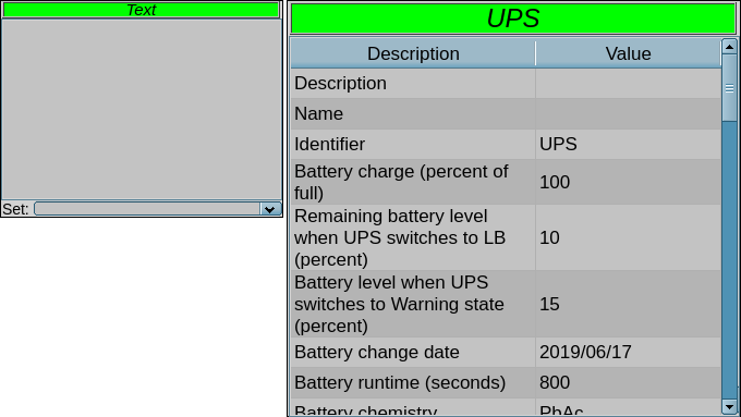
The element on Figure 1.6 serves to display the properties of the data source in tabular form and to highlight them in color, as an object, and to allow the values of the recordable properties to be changed. This element also generates violation notifications according to the features of the object. The element generally uses and represents a representative structure "Complex objects" of the DAQ-templates.
- Sponsored by: PAC HARTRON
Using — development
This widget can be used by the developer in creating mnemonic schemes with consolidated rendering of the object as a whole and entity with properties. To use it you need to add this widget to a mnemonic scheme, adjust for the horizontal, vertical size, by scaling, and link to the data source parameter at the DAQ-template "Complex objects".
Using — runtime
In the runtime mode, a table is displayed with properties in the rows where the first column is the property name and the second column is its value. Row can be backlit by an alarm color in case of violation of this property. Of particular importance is the title of the widget, which displays the name of the object background color which can become an emergency color in the presence of violations in the object.
The properties table is active and at selecting the property row, which means the writing, a field for setting the property value will appear below.
Linking and configuring the attributes
| Identifier | Name | Type | Configuration | Configuration template | Description |
|---|---|---|---|---|---|
| objName | Object: name | String | Input link | Object|NAME | The object name for the title. |
| objDescr | Object: description | Text | Input link | Object|DESCR | The object description for tooltip to the title. |
| objErr | Object: error | String | Input link | Object|err | The object error to form notifications and to highlight the title, the conception error codes are processed. |
| objItems | Object: items | Object | Input link | Object|items | Descriptive object of the properties of the physical object, according to the concept. |
1.7 Calendar (calendar) |
1.0 | GPLv2 | * | en, uk, ru | Roman Savochenko |
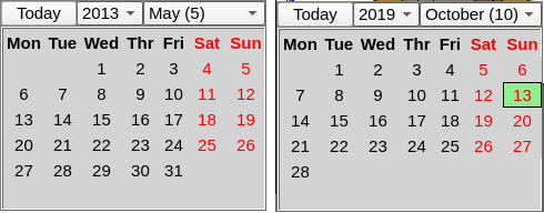
The element on Figure 1.7 is used to display the month of the calendar by week, which allows you to select the year, month and day, as well as switch to the current day.
- Sponsored by: SVItoVYR LTD
Using — development
This widget can be used by the developer to create mnemonic schemes with displaying the calendar. To use it you need to add this widget to a mnemonic scheme, adjust for the horizontal, vertical size, by scaling, and use the attribute "selTime" of this widget to obtain and to set the date.
Using — runtime
In the runtime mode, the year, month, and day are displayed according to the "selTime" attribute.
The user can select the year and month from the list, as well as the day in the represented weeks. An appropriate button is provided for a quick return to the current day.
Linking and configuring the attributes
| Identifier | Name | Type | Description |
|---|---|---|---|
| selTime | Selected time | Integer | The calendar in seconds from the UNIX-epoch. |
1.8 Weather (weather) |
1.0 | GPLv2 | * | en, uk | Roman Savochenko |
The element on Figure 1.8 is used to display weather data from parameters on the DAQ-template "Weather".
Using — development
This widget can be used the developer to create mnemonic schemes with displaying the weather. To use it you need to add this widget to a mnemonic scheme, adjust for the horizontal, vertical size, by scaling, and link to the data source parameter at the DAQ-template "Weather".
Using — runtime
In the runtime mode, the current weather is displayed in the top and forecast displayed in the bottom with details on the images' tooltip.
![]() Images for some weather conditions can be missed yet due to the images are still appended!
Images for some weather conditions can be missed yet due to the images are still appended!
Linking and configuring the attributes
| Identifier | Name | Type | Configuration | Configuration template | Description |
|---|---|---|---|---|---|
| current | Weather: Current | Object | Input link | Parameter|current | The object with current data. |
| forecast | Weather: Forecast | Object | Input link | Parameter|forecast | The object with forecast data. |
2 Root page (SO) (RootPgSo) |
2.7 | GPLv2 | * | en, uk, ru | Roman Savochenko | 1000 ms |
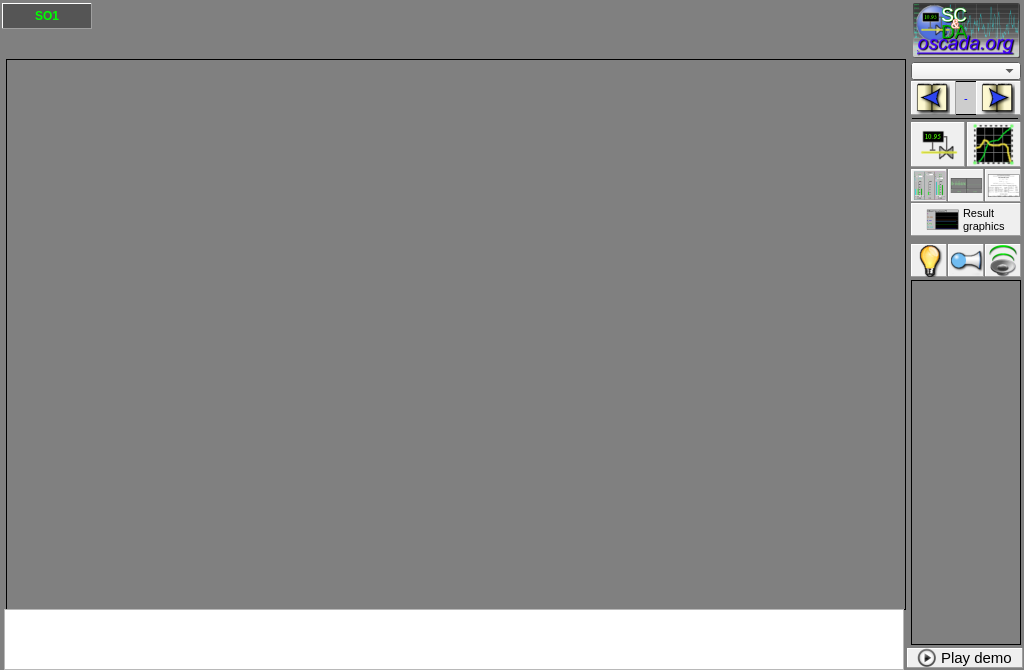
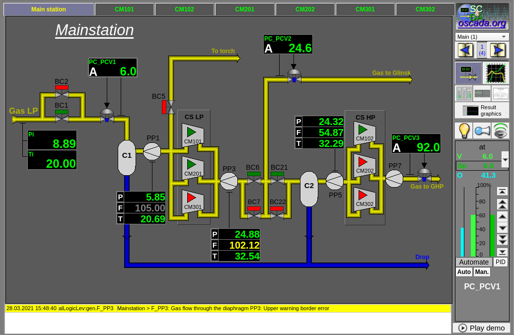
The element-frame, shown in Figure 2, serves as the basis for the user interfaces creating, initially for control the technological processes, grounded on the signal objects (SO).
The root page contains four areas:
- signal objects area of the buttons-indicators (top);
- navigation area by types of view (right-top);
- container of the main frames of the user interface (in the centr);
- container of the control panels (right-bottom).
Signal objects area of the buttons-indicators provides information on the presence of violations in the signal object and for switching between them.
To show the signal objects selection the background color is used, by the styles: backColorButton and backColorButtonSel. And the violations are displayed in the color of the text according to the styles: labColorGood, labColorWarning, labColorAlarm; and in which value the text of the inquieted signal object may blink.
Buttons are currently generated dynamically by copying the first and only, according to the virtual pages of the signal objects in the project tree, with the serial digital identification from 1 (one). The limitation on the number of buttons or signal objects is only the total length of the names of the signal objects that can be placed in two rows of these buttons. That is, for short names we can get up to near 100 signal objects. If the signal object is one, even this single base button is hidden.
Navigation area by types of view — indication of the choice and selection of the type of view, such as: "Mnemonic schemes", "Graph groups", "Contour groups", "Documents" and more; and the listing buttons or the direct selection combobox of the frames into the signal object.
The buttons area of the types of view is dynamic, in the sense of occupying the space of the missing ones, and the meaning of the types of view themselves are configured to different from the default value, i.e. there are two main types of view (view1 and view2), three auxiliary (view3, view4 and view5), as well as one common to the whole interface (view6).
Below are also the buttons of quietation those appear in the event of violations, and at the top is a customizable logo.
Container of the main frames of the user interface — the area of the container for inclusion in it of the basic frames by their choice of buttons of types of view or change of the signal object.
The generic table of active violations — contains coloured rows of actual alarms sorted by their importance with the more important on the top. The widget disabled initially.
Container of the control panels — container area to include control panels of various objects in the container area of the main frames, for example — panel of the parameter, document, graph and more.
Under the control panels container placed a button to start the demo mode — mode in which performed periodic switching for representative frames, changing regimes and other operations by a scenario.
- Sponsored in the dynamization by: Vinnica Poultry Farm
Using — development
This widget can be used only in the root page mode that should be placed in the project's tree as an element "so". Additionally, around the main page should be made following tree hierarchy:
- /control/* — logical container, contains a variety of control panels;
- /so/ — this frame as a container, contains of logical containers of the signal objects:
- {n}/ — logical container of the signal object n (1...), contains logical containers and templates of the types of view:
- [view1|mn]/* — the type of view 1 (typically and early it is the mnemonic schemes), contains a lot of pages of the end frames;
- [view2|ggraph]/* — the type of view 2 (typically and early it is a template of the graphics group), contains a lot of pages of the end frames;
- [view3|gcadr]/* — the type of view 3 (typically and early it is a template of the contours group), contains a lot of pages of the end frames;
- [view4|gview]/* — the type of view 4 (typically and early it is a template of the overview frames panel), contains a lot of pages of the end frames;
- [view5|doc]/* — the type of view 5 (typically and early it is a logical container of the documents), contains a lot of pages of the end frames;
- greg/* — the specific page template of the PID-regulator configuration, contains a lot of pages of the end PID-regulators configuration, statically connected and which are call only by the "PID" button of the element cadre.
- [view6|rg]/ — logical container of the global type of view 6 (typically and early it is the result graphics — common graphs for the entire interface):
- [view6|rg]/* — the type of view 6 (typically and early it is a template of the result graphics), contains a lot of pages of the end frames.
- {n}/ — logical container of the signal object n (1...), contains logical containers and templates of the types of view:
![]() Identifiers of the pages of the types of view, specified as [view1|mn], must be specified in the tree either in the new scheme "view1" or in the old scheme "mn". Mixing is not supported and the view items must not be empty, that is contain at least one active page!
Identifiers of the pages of the types of view, specified as [view1|mn], must be specified in the tree either in the new scheme "view1" or in the old scheme "mn". Mixing is not supported and the view items must not be empty, that is contain at least one active page!
As the text of the signal object buttons, there are used name of the logical container with the corresponding n identifier. The description of this container also takes the text of the tooltip to this button if it is not empty. Description of the container also taken into tooltip for this button, if it is not empty.
All further adjustments and edits around this frame must be made for its copy-link in the project tree, and it is strongly not recommended to edit it in the library, otherwise you will lose the ability to update the library or these changes when updating it!
The text and the tooltip of the buttons of the types of view are directly changed in the corresponding properties of these widgets. The fast keys of the type of view are taken from the toolbar brackets, such as "Graphs (CtrlAlt+G)", and processed accordingly. To change the image of the type of view, it is enough to override the icon of the corresponding view, such as "view1", by loading the image with the appropriate name in the project Mime-data.
To enable the generic table of active violations just set 1 (one) in the frame links configuration for "alarms > en".
To enable and configure the returning to some non privilege user after some time of the inactivity just set {minutes)-{user} in the frame links configuration for "defUser".
You can change the image of the logo in the same way as the image of the type of view, that is, upload a new image called "logo" to the project's Mime-data, and then adjust the geometry of the logo widget to the desired proportions. You can move the image widget to the left by moving the signal object button to the right by the size of the logo. If you do not need the logo at all then to nullify the widget width, but do not remove it!
Potentially, you can also move the navigation bar and the control panel container to the left by moving the main frame container, and maybe the signal object button, to the right.
If necessary, the root page can be appended with additional elements that do not require special processing, that is, changes to the initial procedure of the frame, that is no longer using but editing. ![]() It should be noted here that reducing the size of the containers will lead to the appearance of scrollbars and-or will require adjusting the frames of placement in the container but this may not be necessary given the extension of the container to unused button rows of the signal objects.
It should be noted here that reducing the size of the containers will lead to the appearance of scrollbars and-or will require adjusting the frames of placement in the container but this may not be necessary given the extension of the container to unused button rows of the signal objects.
Using — runtime
When starting the frame in the runtime mode, there are first constructed the buttons of the signal objects, which are formed in two rows, after which the container of the main frames expands up for one row if there is enough one, or for two if the signal object is one. Next, there are formed buttons of the types of view, present of which are activated and expanded to fill the space of the missing ones.
After the dynamic forming, the frame periodically controls the frame change in the main frame container, which is displayed by the corresponding background color in a button of the signal object and the type of view to which the frame belongs. Between the listing buttons, information about the total number of frames and the current position is updated, and the buttons themselves are activated according to the possibility of listing in the current frame position. For the combobox of direct frames selection from list, respectively, the current list of frames is formed and the name of the current one is set. It also monitors the status of violation-notification of the signal objects, which is accordingly displayed by the text color of the buttons of the signal object and its flashing, as well as the quietation buttons are activated or deactivated.
![]() The frame supports now of working with very big "Periodic processing" value or disabling the periodic processing in whole (the value -2) and that value also propagated to the child pages and widgets if they want such behaviour (the value -1). That is possible by a mechanism of the events early processing and the possibility of control the processing periodicity from the procedure.
The frame supports now of working with very big "Periodic processing" value or disabling the periodic processing in whole (the value -2) and that value also propagated to the child pages and widgets if they want such behaviour (the value -1). That is possible by a mechanism of the events early processing and the possibility of control the processing periodicity from the procedure.
Changing of the frame in the control panel container are not tracked and their are generally called from the main frame interface, unless it is cleared by changing the main frame by opening the panel-terminator.
From the basic actions, the frame allows the user to select the signal object, the type of view and the corresponding frame. By pressing the button of the signal object, the type of view, directly selecting in the combobox or listing; resulting in a call to the corresponding frame in the main frame container. From the ancillary actions, the user can quiet the violation-notification and start the Demo-mode, if one provided. The default frame setting involves servicing a number of hotkeys, such as CtrlAlt+[1...0] to call the signal objects 1 to 10, and CtrlAlt+[MGCVDR] to call appropriate types of view.
Linking and configuring the attributes
| Identifier | Name | Type | Description |
|---|---|---|---|
| alarms > en (config) | Alarms > Enabled | Boolean | The generic table of active violations enabling |
| defUser (config) | Default to return, {minutes)-{user} | String | Enabling and configuring the returning to some non privilege user after some time of the inactivity by the string {minutes)-{user}. |
| demoPlayProc | Procedure of the Demo play | Text | A procedure on the JavaLikeCalc language to play some demo. Enables the Demo-mode button in the runtime mode. To an example of such procedure see the demo-projects AGLKS and Boiler! |
| The visualizer specific attributes common for both UI.Vision (more) and UI.WebVision (more) | |||
| keepAspectRatio | Keep aspect ratio on scale | Boolean | Keep aspect ratio of the pages on scale. |
| stBarNoShow | Do not show the status bar | Boolean | Hide the status bar of the main window. |
| The visualizer specific attributes for UI.Vision (more) | |||
| runWin | Run window | Integer numbers selection | Setting the mode of the main window execution:
|
| statLine | Status line items | Text | Text field with description of the status line items. |
| winPosCntrSave | Windows position control and save | Boolean | Enabling the windows position control and save. |
| Main procedures of the notification mechanism | |||
| notify0 | Notification: type 0 (Light) | Text | |
| notify1 | Notification: type 1 (Buzzer) | Text | |
| notify2 | Notification: type 2 (TextSpeech) | Text | |
3 Main frames
Contains elements-frames of the template and end types, as well as elements-widgets and panels from which they are built and used. These frames are intended to be placed in the project tree of the pages, built on the concept of the signal objects of the root page "RootPgSo". However, they may be located as separate entities or as part of your own concept of the page management, but it should be take in account that frames often refer and call certain control panels of the common usage and related elements!
3.1 Graphics group (grpGraph); Graphics group 10 (grpGraph10) |
1.6 | GPLv2 | * | en, uk, ru | Roman Savochenko | -1 ms (parent) |
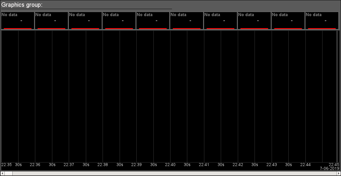
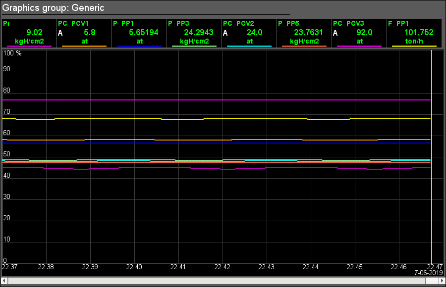
The element-frame shown in Figure 3.1 is provided for simultaneous observation of trends and control the parameters in the signal object, includes both instances of the widget "Graphics group element" of each parameter (up to 8 or 10) and the primitive "Diagram" to monitor the parameters' trends and browsing history, and also the scroll bar for fast navigation on allowed history of selected parameters for show. The variant in 10 trends is inherited from the base variant in 8 trends and you can create your own variants by inherit the base and append more graphics group elements.
Using — development
The frame is designed to perform the role of page-template, and should therefore be placed directly in the project's tree. In the project-template "Signal groups", for each signal object, this frame is included in the role of a template that allows you to create on its basis a set of pages of the graphics group. To each frame can be connected up to eight-ten parameters, setting the links. Trends, for which there are not set the links, will be hidden at runtime or allowed for user's selection at case of presence the list of the parameters to select in the attribute "Select: parameters accessible to select" (the list format described in the parameters selection dialog).
The default trend depth in the past is set at 10 minutes — for current operational control, which can be changed directly by editing the corresponding field of the diagram widget, for example, for the project template page, to spread to all end pages.
Using — runtime
In the runtime mode, the trends, for which links have been set, are displayed. Control of the parameters from the graphics group element, described in detail in the section of the "Graphics group element (ElViewGraph)" widget. Additionally you can control the display properties of graphs, for what, together this page, there automatically opens the graph control panel or you have to click the left mouse button in the graph area.
![]() The frame supports now of working with very big "Periodic processing" value and that value is set now to inherit from parent page/session (the value -1). That is possible by a mechanism of the events early processing and the possibility of control the processing periodicity from the procedure.
The frame supports now of working with very big "Periodic processing" value and that value is set now to inherit from parent page/session (the value -1). That is possible by a mechanism of the events early processing and the possibility of control the processing periodicity from the procedure.
Linking and configuring the attributes
| Identifier | Name | Type | Configuration | Configuration template | Description |
|---|---|---|---|---|---|
| name | Name | String (translate) | Constant | Group name | |
| allowSelLst | Select: parameters accessible to select | Text | No | Place here the parameters for selection by the user in a list of the DAQ-paths to them (for more details see the "Graph parameter selection" dialog):
/LogicLev/proc/prm_CPU/prm_load /LogicLev/proc/prm_MEM/prm_use /LogicLev/proc/prm_CPU/prm_T | |
| perUserSel | Select: save the selection per user | Boolean | No | Set to save the user selection separately | |
| Element {n} from 1 to 8(10) | |||||
| el{n} | List of the linking parameters corresponds to the list of the "Graphics group element (ElViewGraph)" widget | ||||
3.1.1 Graphics group element (ElViewGraph) |
1.5 | GPLv2 | * | en, uk, ru | Roman Savochenko | 2000 ms |
The element-widget shown in Figure 3.1.1 is provided to create graphics groups. The widget contains information about parameter, the regulator mode, if the parameter is such, the units of analog parameter, as well as the color corresponding to the parameter's trend. The widget commonly uses and represents the representative structure of the DAQ-templates "Analog signal" and "Discrete block".
Using — development
Though this widget is not intended for independent use in isolation from the graphics groups, it can be used, for example, placing it to the mnemonic scheme and linking with the data source parameter.
Using — runtime
In the runtime mode, in the main field of the element, there are displayed the parameter name, the regulator mode (only for the regulators), the current value-variable and the unit of this parameter; which, depending on the presence of a violation, are displayed in the color style: labColorGood, labColorWarning, labColorAlarm. At the hardware errors and non validity the data, the last value is greyed out.
Except the available visual data, a number of control elements are provided:
- "Selection" — at pressing the left mouse button in the widget area, in the right side will appear the control panel, and the widget selection will be displayed by the border flashing.
- "Hide/Show" — double-clicking in the widget area toggles the show-hiding of the item's graph.
- "Context menu functions" — a number of functions are provided through the context menu:
- "Passport" — getting the passport of the parameter, which will present all it properties.
- "Hide/Show" — toggling the display or hiding of a graph of this element, similar to a double click.
- "Show one" — single graph display of the selected parameter in its native scale by hiding the rest of the items in the group.
- "Show all" — display all parameter graphs in the group.
- "Calculating" — calling the calculating dialog above the visible data of the selected parameter.
- "Select" — calling the selection dialog of the parameter from the list of ones available for selection — the attribute "Select: parameters accessible to select" of the owner cadre. This item is only available if a selection list is available. From the dialog the user can clear the parameter also and what for statically preset parameters means of return to the static parameter.
The widget saves of a user selected parameter in the session table of the project and loads the parameter at next run, include the trend color which default value typically takes from a style.
![]() The widget supports now of working with very big "Periodic processing" value and that value is set now to inherit from parent widget/page/session (the value -1). That is possible by a mechanism of the events early processing and the possibility of control the processing periodicity from the procedure.
The widget supports now of working with very big "Periodic processing" value and that value is set now to inherit from parent widget/page/session (the value -1). That is possible by a mechanism of the events early processing and the possibility of control the processing periodicity from the procedure.
Linking and configuring the attributes
| Identifier | Name | Type | Configuration | Configuration template | Description |
|---|---|---|---|---|---|
| name | Name | String (translate) | Input link | Parameter|NAME | Parameter name-code, to display in the name field. |
| dscr | Description | Text (translate) | Input link | Parameter|DESCR | Parameter description, to place in the tooltip and statusbar. |
| addr | Address | Address | Input link | Parameter|var | Address to the parameter attribute for the trend building. |
| color | Graphic color | String | No | Working color of the trend | |
| colorDef | Default color from the style | String | No | Default color of the trend on the cadre level | |
| Analog parameters | |||||
| ed | Dimension | String (translate) | Input link | Parameter|ed | |
| prec | Precision | Integer | Input link | Parameter|prec | Number signs after the dot, for positive values, and precision (signs in whole), for negative, to display the real end variable on the screen. |
| log | Logarithmic scale | Boolean | Input link | Parameter|log | |
| max | Maximum | Real | Input link | Parameter|max | Upper limit value of the parameter. |
| min | Minimum | Real | Input link | Parameter|min | Minimum limit values of the parameter. |
| aMax | Border up alarm | Real | Input link | Parameter|aMax | |
| aMin | Border down alarm | Real | Input link | Parameter|aMin | |
| wMax | Border up warning | Real | Input link | Parameter|wMax | |
| wMin | Border down warning | Real | Input link | Parameter|wMin | |
| pModeA | Regulator mode: auto | Boolean | Input link | Parameter|auto | The regulator mode "Automatic". |
| pModeC | Regulator mode: cascade | Boolean | Input link | Parameter|casc | The regulator mode "Cascade". |
| Discrete parameters | |||||
| digComs | Digital: commands | String (translate) | Constant | Names and colors of the buttons of the commands are in the format {On}[-color]:{Off}[-color][:{Stop}[-color]]. Default colors are: green, red and yellow. | |
| digStts | Digital: states | String (translate) | Constant | Names and colors of the labels of the states are in the format {On}[-color]:{Off}[-color]. Default colors are: green and red. | |
| digRevers | Digital: reversion | Boolean | Constant | Discrete signal reverse. | |
3.1.2 Graph parameter selection (graphSelPrm) |
1.5 | GPLv2 | * | en, uk, ru | Roman Savochenko | -1 ms (parent) |
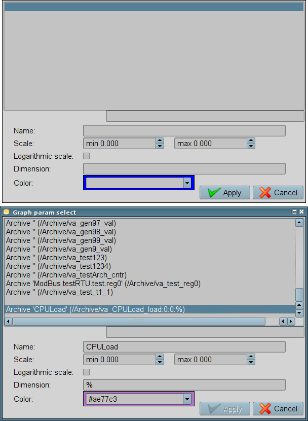
The element, shown in Figure 3.1.2, implements a dialog of selection the data source, often the archive ones, for the trend formation in the "Graphics group" frame. Selection is provided from the list, specified in the attribute "Select: parameters accessible to select (allowSelLst)" of the frame-initiator. For the selected source you can specify the name, scale, logarithmic scale, dimension and the color of the trend.
In the "Select: parameters accessible to select (allowSelLst)" attribute the data sources should be placed in the following way:
- {DAQ_Arh_addr}[:Name[:min:max[:dim]], where:
- "DAQ_Arh_addr" — address of the parameter, for the group linking, or address of the attribute with data from the "Data acquisition (DAQ)" subsystem, as well as the address of the values' archive, for example:
- /LogicLev/gen/prm_F3 — address of the "F3" parameter ;
- /DAQ/System/AutoDA/prm_CPULoad/load — address of the "load" attribute of the "CPULoad" parameter;
- /Archive/va_LC21_1_var — address of the "LC21_1_var" archive.
- "Name" — name of the source to display. At the group linking the name will be taken from the "NAME" attribute.
- "min", "max" — display scale. At group linking the scale will be taken from the "min" and "max" attributes, respectively. In the case of the scale absence (min >= max) the auto-scale will be enabled.
- "dim" — dimension (measuring unit) of the parameter to display. At the group linking it will be taken from the "ed" attribute.
- "DAQ_Arh_addr" — address of the parameter, for the group linking, or address of the attribute with data from the "Data acquisition (DAQ)" subsystem, as well as the address of the values' archive, for example:
- <varhs> — template of the group selection, if you specify it all available archives in the system will be included into the selection list.
Examples of the "Select: parameters accessible to select (allowSelLst)" attribute's content:
/System/AutoDA/prm_CPULoad/load:CPU Load:0:100:%
/LogicLev/gen/prm_F3
<varhs>
Using — development
This frame should be placed to the panels' logical container of the project tree. The "Select: parameters accessible to select (allowSelLst)" attribute must be defined to a list of sources according to the rules described above in the "Graphics groups", which should provide the selection of the sources by the user. As a result, the "Select" item will appear in the context menu of the Graphics group element.
Using — runtime
Calling the dialogue is made by the "Select" item of the Graphics group element context menu. The dialogue provides the user to the possibility of selection the data source from the list, as well as an indication of its basic parameters: name, scale, logarithmic scale, dimension and the color of the trend, which you also can select typical/styled one by clearing. When you accept the dialogue the selected parameters are applied to the graphics group element chart, replacing the links. The "<Clear>" item selection and applying causes to clearing all the links and the graph's item. Into a text field under the list you can rapidly find any needed parameter.
3.1.3 Graph parameter calculation (graphCalc) |
1.0 | GPLv2 | * | en, uk, ru | Roman Savochenko |
The element, shown in Figure 3.1.3, implements a dialog of user calculation of the selected graph parameter for the graphically visible data. The user is given an option to select calculations from the built-in library, the privileged user ("root" or in the "ITW" group) has the opportunity to edit or write their own calculation procedure.
In general, the built-in library currently contains the following functions of the user calculation:
- Sum, at hour.
- Average and range.
Using — development
This frame should be placed to the panels' logical container of the project tree.
Using — runtime
Calling the dialogue is made by the "Calculation" item of the Graphics group element context menu. The dialog gives the user the choice of the function of calculation the visible data of the selected parameter and the ability to edit-write their own function, for the privileged user. The calculation result is located in the corresponding text box.
3.2 Contours group (grpCadr) |
1.3 | GPLv2 | * | en, uk, ru | Roman Savochenko | -1 ms (parent) |
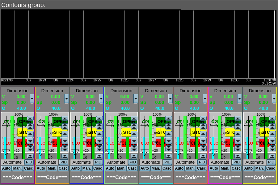
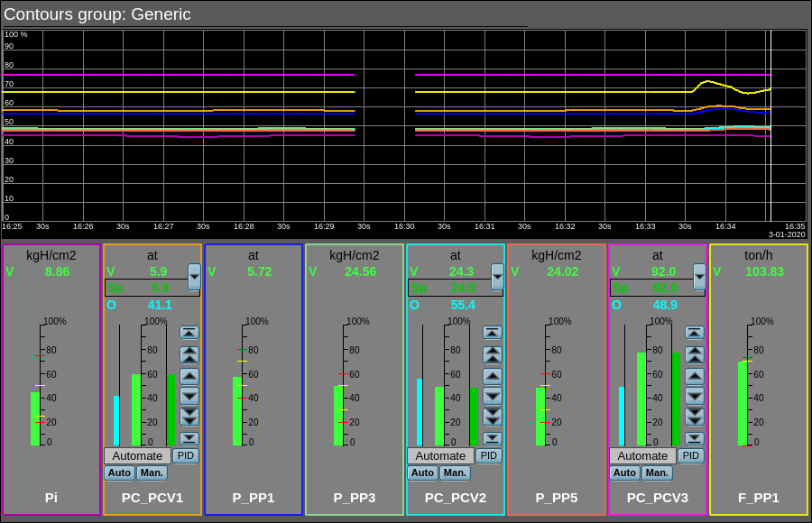
The element-frame, shown in Figure 3.2, provides for simultaneous monitoring and control of contours of several parameters, up to eight, includes both instances of the widget "Element cadre for each contour, and the primitive "Diagram" to monitor the trends of the contours and viewing history.
Using — development
The frame is designed to perform the role of page-template, and should therefore be placed directly in the project's tree. In the project-template "Signal groups", for the first signal object, this frame is included in the role of a template that allows you to create on its basis a set of pages of the contours group. To each frame can be connected up to eight parameters, setting the links. Contours and trends, for which there are not set the links, will be hidden at runtime.
The default trend depth in the past is set at 10 minutes — for current operational control, which can be changed directly by editing the corresponding field of the diagram widget, for example, for the project template page, to spread to all end pages.
Using — runtime
In the runtime mode, the contours and trends, for which links have been set, are displayed. Control of the parameters by contours, described in detail in the section of the "Element cadre" panel. In addition to this you can control the trends display properties, which requires the left mouse button to click in the trend's area and by means of appeared trend's control panel to make the necessary actions.
![]() The frame supports now of working with very big "Periodic processing" value and that value is set now to inherit from parent page/session (the value -1). That is possible by a mechanism of the events early processing and the possibility of control the processing periodicity from the procedure.
The frame supports now of working with very big "Periodic processing" value and that value is set now to inherit from parent page/session (the value -1). That is possible by a mechanism of the events early processing and the possibility of control the processing periodicity from the procedure.
Linking and configuring the attributes
| Identifier | Name | Type | Configuration | Configuration template | Description |
|---|---|---|---|---|---|
| grpName | Group name | String | Constant | Group's name | |
| Element {n} from 1 to 8. | |||||
| el{n} | The list of the linking parameters corresponds to the "Element cadre (ElCadr)" panel | ||||
3.3 Group of overview frames (ViewCadr) |
1.1 | GPLv2 | * | en, uk, ru | Roman Savochenko | -1 ms (parent) |
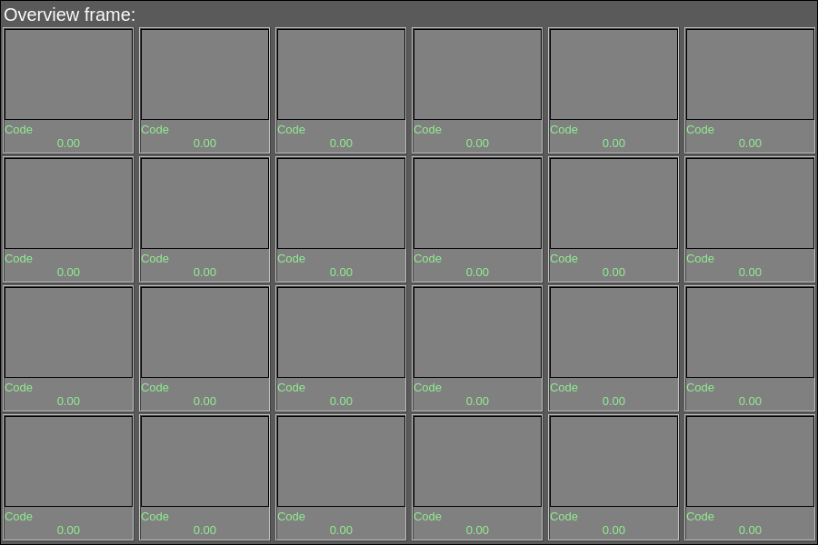
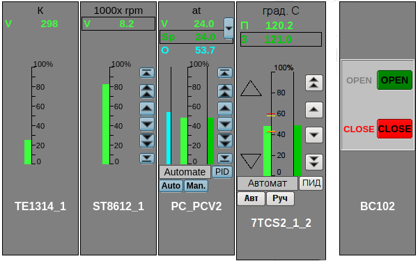
The element-frame shown in Figure 3.3 is used to display the current parameter trends in individual frames-widgets with up to 24 units (6x4) for which scaling is supported depending on their configured number. The frames-widgets of the parameter trends are implemented with the satellite widget "Frame of the group of overview".
Using — development
The frame is designed to perform the role of page-template, and should therefore be placed directly in the project's tree. In the project-template "Signal groups", for the first signal object, this frame is included in the role of a template that allows you to create on its basis a set of pages of the group of overview. Frames-widgets, for which there are not set the links, will be hidden at runtime and will be performed the proportional scaling to missing full rows and columns to fill the entire frame.
Using — runtime
In the runtime mode, the frames-widgets, for which links have been set, are displayed. Control of the parameters from the frames-widgets, described in detail in the section of the "Frame of the group of overview" widget.
Linking and configuring the attributes
| Identifier | Name | Type | Configuration | Configuration template | Description |
|---|---|---|---|---|---|
| name | Name | String | Constant | Frame's name | |
| Frame-widget {r}_{c}, where {r} — rows from 1 to 4 and {c} - columns from 1 to 6. | |||||
| el{r}_{c} | The list of linked parameters corresponds to ones of the "Frame of the group of overview (ElViewCadr)" widget | ||||
3.3.1 Frame of the group of overview (ElViewCadr) |
1.2 | GPLv2 | * | en, uk, ru | Roman Savochenko | -1 ms (parent) |
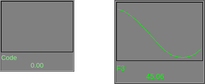
The element-widget, shown in Figure 3.3.1, serves as the basis for the group of overview frames and is not usually used independently. The widget displays the text information about parameter in the form of the name and value, and a trend of the parameter for small period of time (2 minutes) to observe the current trend of the parameter with auto-scaling on the value scale. The widget commonly uses and represents the representative structure of the DAQ-template "Analog signal".
Using — development
Though this widget is not intended for independent use, in isolation from the group of overview frames, it can be still used, for example, placing it to the mnemonic scheme and linking with the data source parameter.
Using — runtime
In the runtime mode, the main field of the element displays the parameter name, the current value-variable and the trend of the parameter; which are always displayed in the style color: labColorGood.
In the active mode of the element you can obtain the parameter passport clicking the right mouse button on the body of the widget. The passport will present all properties of the parameter. Pressing the left mouse button in the widget body will cause to appear in the panels area for control panel of the parameter, and the selection of this widget will be displayed with the blinking frame.
![]() The widget supports now of working with very big "Periodic processing" value and that value is set now to inherit from parent widget/page/session (the value -1). That is possible by a mechanism of the events early processing and the possibility of control the processing periodicity from the procedure.
The widget supports now of working with very big "Periodic processing" value and that value is set now to inherit from parent widget/page/session (the value -1). That is possible by a mechanism of the events early processing and the possibility of control the processing periodicity from the procedure.
Linking and configuring the attributes
| Identifier | Name | Type | Configuration | Configuration template | Description |
|---|---|---|---|---|---|
| name | Name | String | Input link | Parameter|NAME | Parameter name (code) for display in the name's field. |
| addr | Address | Address | Input link | Parameter|var | Address to the value attribute of the parameter to construct the trend. |
| var | Variable | Real | Input link | Parameter|var | Directly the parameter value to be displayed in the value field. |
3.4 Result graphics (ResultGraph) |
1.1 | GPLv2 | * | en, uk, ru | Roman Savochenko | -1 ms (parent) |
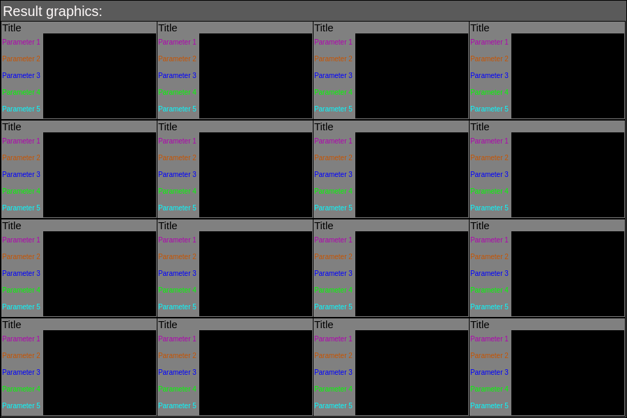
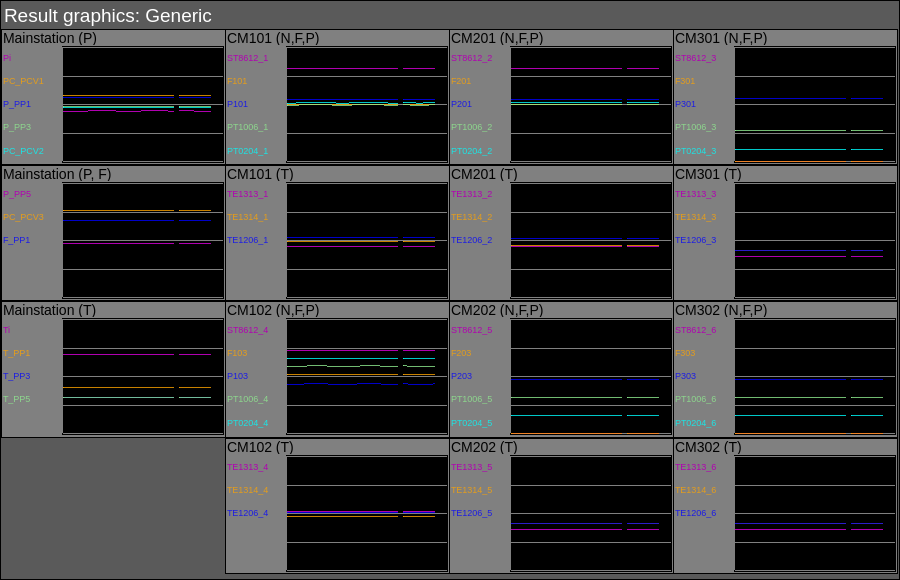
The element-frame shown in Figure 3.4 is used to display a group of the current parameter trends (up to 5) in individual frames-widgets with up to 16 units (4x4) for which scaling is supported depending on their configured number. The frames-widgets of the parameter trends are implemented with the satellite widget "Frame of the result graphics".
Summary the total number of displayed graphs in one frame reaches 80, and it is intended to form a separate type of view that is used outside the signal objects — globally for the entire visualization project.
![]() The frame doesn't support any control.
The frame doesn't support any control.
Using — development
The frame is designed to perform the role of page-template, and should therefore be placed directly in the project's tree. In the project-template "Signal groups", at the root page level it has a special virtual page "Result graphics" with the result graphics template, that allows you to create on its basis a set of pages of the result graphics. Frames-widgets, for which there are not set any links, will be hidden at runtime and will be performed the proportional scaling to missing full rows and columns to fill the entire frame.
Using — runtime
In the runtime mode, the frames-widgets, for which links have been set, are displayed.
Linking and configuring the attributes
| Identifier | Name | Type | Configuration | Configuration template | Description |
|---|---|---|---|---|---|
| grpName | Group name | String | Constant | Group name | |
| Frame-widget {n} from 1 to 16. | |||||
| el{n} | The list of linking parameters corresponds to the "Frame of the result graphics (ResultGraphEl)" widget. | ||||
3.4.1 Frame of the result graphics (ResultGraphEl) |
1.2 | GPLv2 | * | en, uk, ru | Roman Savochenko | -1 ms (parent) |
The element-widget, shown in Figure 3.4.1, serves as the basis for the result graphics and is not usually used independently. The widget displays the name of the group and up to five trends, with their text labels, over a fixed period of time (10 minutes) to observe the current trend of the parameters. The widget commonly uses and represents the representative structure of the DAQ-template "Analog signal".
Using — development
Though this widget is not intended for independent use, in isolation from the result graphics, it can be still used, for example, placing it to the mnemonic scheme and linking with the data source parameter.
Using — runtime
In the runtime mode, the main element field displays the group header, headers and trends of the parameters in the configuration-defined or styled colors.
![]() The widget supports now of working with very big "Periodic processing" value and that value is set now to inherit from parent widget/page/session (the value -1). That is possible by a mechanism of the events early processing and the possibility of control the processing periodicity from the procedure.
The widget supports now of working with very big "Periodic processing" value and that value is set now to inherit from parent widget/page/session (the value -1). That is possible by a mechanism of the events early processing and the possibility of control the processing periodicity from the procedure.
Linking and configuring the attributes
| Identifier | Name | Type | Configuration | Configuration template | Description |
|---|---|---|---|---|---|
| title | Title | String | Constant | Displays at the top of the graphs, in the absence the graphs field expands up. | |
| Parameter {n} from 1 to 5. | |||||
| p{n}_addr | Parameter{n}: address | Address | Input link | Parameter {n}|var | Address to the parameter attribute for plotting the graph {n}. |
| p{n}_clr | Parameter{n}: color | Color | From style | labColorGrph{n} | |
| p{n}_max | Parameter{n}: maximum | Real | Input link | Parameter {n}|max | Upper limit of the trend. |
| p{n}_min | Parameter{n}: minimum | Real | Input link | Parameter {n}|min | Lower limit of the trend. |
| p{n}_name | Parameter{n}: name | String | Input link | Parameter {n}|NAME | Short name of the parameter to display in the field on the left. |
3.5 Regulator's control panel (cntrRegul) |
1.2 | GPLv2 | * | en, uk, ru | Roman Savochenko |
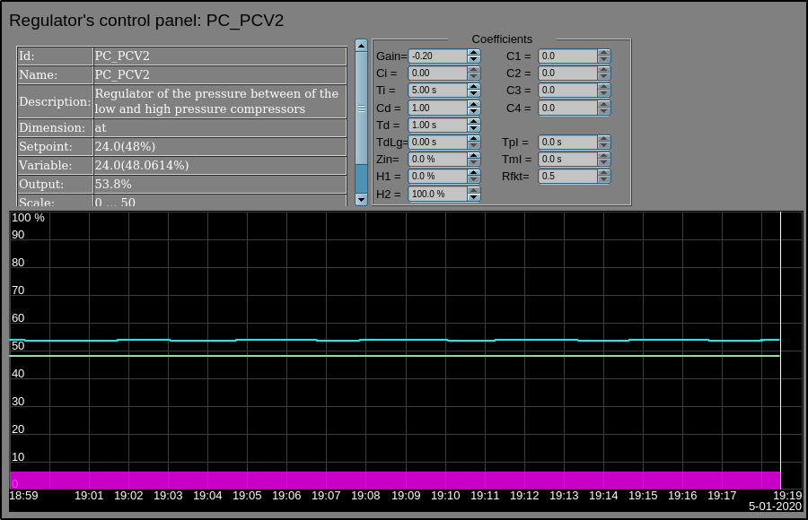
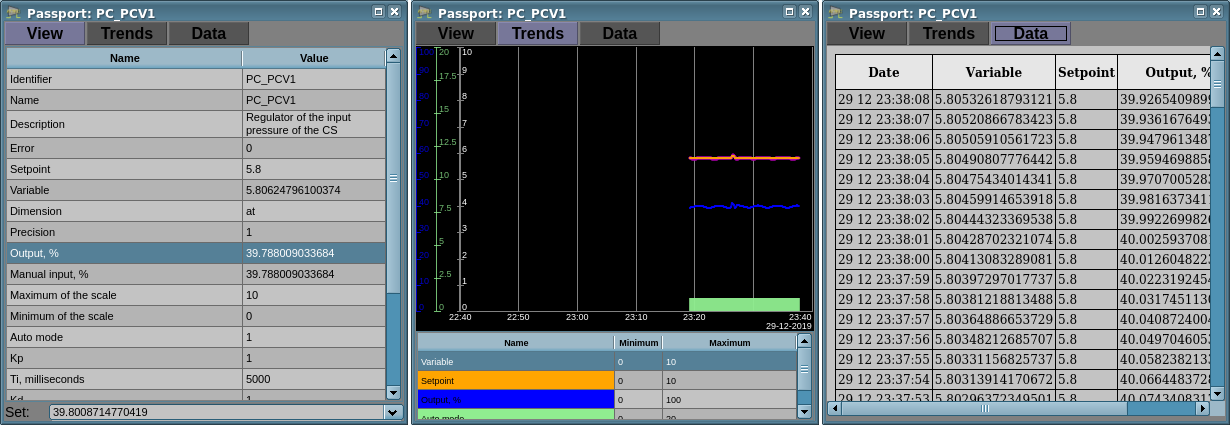
Element-frame, shown in Figure 3.5, is used for adjustment of PID-regulator, includes information about the parameter-regulator, fields of the regulator's settings and the "Diagram" primitive, to monitor the trends of the regulator and browsing history. The frame commonly uses and represents the representative structure of the DAQ-template for the analog and pulse PID-regulators.
- Sponsored by: DIYA Ltd
Using — Development
This frame can be used as a panel, called from the control of panel of the parameters, as well as a template-page. The frame should be placed directly in the project's tree, namely to the panels container, where the dynamic linking will be performed to the regulator parameter. To create a static list of contours of the regulators' configuration, with the possibility of listing in it, you must place them in the container "greg" of the regulators' contours of each signal object and statically link them with the corresponding parameter, and to ensure equality of the panel's ID and the linked parameter.
The default trend depth in the past is set at 20 minutes — for current operational control, which can be changed directly by editing the corresponding field of the diagram widget.
Using — runtime
In the runtime mode, you can see:
- name of the regulator parameter;
- field with the regulator properties in the composition: identifier, name, description, measuring unit, set-point, variable output, scale and mode;
- coefficients of the regulator configuration: Gain, Ci, Ti, Cd, Td, TdLg, Zin, H1, H2, C1, C2, C3, C4, Tpl, Tml and Rfkt;
- the diagram area with displaying the trends: variable (green, the style "labColorGrph4"), set-point (blue, the style "labColorGrph3"), the analog output (cyan, the style "labColorGrph5"), the regulator mode "Automate" (magenta, the style "labColorGrph7") and the digital outputs (orange, the style "labColorGrph2").
Users have an ability to change the PID-regulator's coefficients, mode, set-point, output and immediately to see the reaction on the diagram. In addition, the user may learn the history of the regulator work, which requires the left mouse button click in the graph area and by means of appeared trend's control panel to make the necessary navigation actions. To return the control panel of the parameter the left mouse button must be clicked in an empty area of the frame.
Linking and configuring the attributes
| Identifier | Name | Type | Configuration | Configuration template | Description |
|---|---|---|---|---|---|
| SHIFR | Parameter: code | String | Input link | Parameter|SHIFR | |
| NAME | Parameter: code | String | Input link | Parameter|NAME | |
| DESCR | Parameter: description | String | Input link | Parameter|DESCR | |
| max | Parameter: scale maximum | Real | Input link | Parameter|max | |
| min | Parameter: scale minimum | Real | Input link | Parameter|min | |
| ed | Parameter: dimension of variable | String | Input link | Parameter|ed | |
| prec | Parameter: precision | Integer | Input link | Parameter|prec | Number of digits after coma, placed in value and set-point of the PID. |
| var | Parameter: variable | Real | Input link | Parameter|var | |
| var_addr | Parameter: variable address | Address | Input link | Parameter|var | Address for the trend building of the variable. |
| PID-regulator | |||||
| auto_addr | Parameter: auto | Address | Input link | Parameter|auto | Address for the trend building of the mode "Auto". |
| sp | Parameter: set-point | Real | Input link | Parameter|sp | |
| sp_addr | Parameter: set-point address | Address | Input link | Parameter|sp | Address for the trend building of the set-point. |
| out | Parameter: output | Real | Input link | Parameter|out | |
| out_addr | Parameter: output address | Address | Input link | Parameter|out | Address for the trend building of the analog output. |
| Hdwn | Parameter: bottom output border | Real | Full link | Parameter|Hdwn | Limit the analog output value at the bottom. |
| Hup | Parameter: upper output border | Real | Full link | Parameter|Hup | Limit the analog output value at the top. |
| Kp | Parameter: gain coefficient | Real | Full link | Parameter|Kp | |
| Ki | Parameter: coeff. of integration | Real | Full link | Parameter|Ki | |
| Ti | Parameter: time of integration | Real | Full link | Parameter|Ti | |
| Kd | Parameter: coeff. of differential | Real | Full link | Parameter|Kd | |
| Td | Parameter: time of differentiation | Real | Full link | Parameter|Td | |
| Tzd | Parameter: differential part lag time | Real | Full link | Parameter|Tzd | |
| Zi | Parameter: insensitivity area | Real | Full link | Parameter|Zi | |
| K1 | Parameter: input 1 coefficient | Real | Full link | Parameter|K1 | |
| K2 | Parameter: input 2 coefficient | Real | Full link | Parameter|K2 | |
| K3 | Parameter: input 3 coefficient | Real | Full link | Parameter|K3 | |
| K4 | Parameter: input 4 coefficient | Real | Full link | Parameter|K4 | |
| Pulse PID-regulator | |||||
| impQdwn_addr | Parameter: address of impulse output down | Address | Input link | Parameter|impQdwn | Address for the trend building of the pulse output "Down". |
| impQup_addr | Parameter: address of impulse output up | Address | Input link | Parameter|impQup | Address for the trend building of the pulse output "Up". |
| KImpRfact | Parameter: rate factor | Real | Full link | Parameter|KImpRfact | Asymmetry in up and down pulse width generation. |
| TImpMin | Parameter: minimal impulse time | Integer | Full link | Parameter|TImpMin | Pulses are generated from the specified width. |
| TImpPer | Parameter: pulses period | Integer | Full link | Parameter|TImpPer | Periodicity of repetition of pulse generation. |
3.6 Alarms — state (alarmsSt) |
1.5 | GPLv2 | * | en, uk, ru | Roman Savochenko |
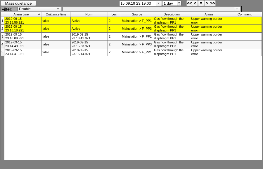
The element-frame in Figure 3.6 serves to display the violations history and to update their dynamically for the current time in a full-format tabular form, to highlight them in color and text and the possibility of multilevel filtering. The violations are obtained from the buffer of current-active violations of OpenSCADA and archive(s), specified in the configuration field "alArch". In fact, the element implements the primitive "Protocol" functions for violations and extension opportunities.
The frame in general contains elements:
- the messages table — the main area;
- a button of the mass confirmation — the top left;
- a combobox of selection of the data model level sort rule, it provides sorting by the selected column from the list defined in colms and by default this is time, as the second criterion (last on the top) — the next one top left;
- a navigation panel at the messages history-archive — the top centre and right, consisting of:
- the top-end time of the data;
- size — depth of the data requesting;
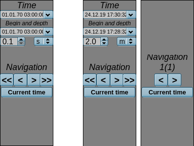
- the buttons of fast listing — per one and five intervals-depths forward and backward and at the current time;
- a button to quickly move to the next part of a large query interval, divided by the limit on the number of messages in the table — for very dense-active messages generation;
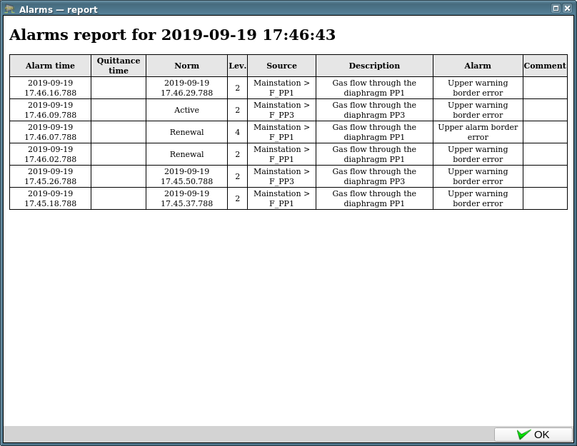
- a button to call-form of the report document for the actual table's data.
- elements of the five-level filter with displaying the next level at activation the last one, by selecting a column from the list of specified ones in colms — the top after the previous one.
According to the announced list of the control elements, message sorting can be modified by the user, both by the built-in column sorting mechanism of a single visualizer and at the data model level, if such function the visualizer is not provided. Considering the basic purpose of the frame is the status of the violations (ie history), the default sorting rule is the "last" to the messages top.
The frame is created, and is usually used, in pair with the widget of dynamically display the active violations, which is completed with main features of this frame but only for active violations and in the small widget.
The main user extension is the ability to define visible table fields from a list of options:
- atm — time of the violation appearing;
- qttm — time of the violation confirmation;
- nrmtm — time of coming-returning the violation to the state "NORM";
- lev — level of the violation;
- type — type-name of the violation from the level lev and the attribute "types";
- cat — category of the violation;
- mess — full and unparsed text of the violation message;
- prm — address of the DAQ-parameter of the data source;
- dscr — description of the violation from the source DAQ-parameter;
- dscrCust{N} — description of the user field N;
- alrm — text of the violation;
- cmnt — commentary of the violation.
![]() This frame and its fields generally represent the structure of the violation message, which is described in detail in the Program manual.
This frame and its fields generally represent the structure of the violation message, which is described in detail in the Program manual.
As you can see from the list of possible table fields, this item supports confirmation, commenting, and user fields.
- Sponsored by: Ustijancev Michael
- Sponsored by, for appending the new user field "Type" on 0.2 HD[!]: INSERTEC LTDA
Using — development
The widget is designed to perform the role of page, and should therefore be placed directly in the project's tree. After adding, the frame must be adjusted for the properties, such as the list and the order in which the table fields are displayed.
![]() Because the frame displays the status and the history of the violations, the creation and use of the message archiver is mandatory. Therefore, create or use a template archiver "Alarms" of the startup project with duplicate exclusion options, and specify it (FSArch.alarms) in the frame property "alArch".
Because the frame displays the status and the history of the violations, the creation and use of the message archiver is mandatory. Therefore, create or use a template archiver "Alarms" of the startup project with duplicate exclusion options, and specify it (FSArch.alarms) in the frame property "alArch".
The combobox of selecting sorting rule is disabled by default for the sake of using the built-in column sort function of the table of the corresponding visualizer. If this feature is not provided by the visualizer then enable this combo box.
If you want to exclude the validation function then you have to exclude the validation time "qttm" from the list and make the table element inactive.
The report building at the table data is also disabled by default. To enable it, you have to place the frame of alarms reporting in the logical container of panels of the project tree and then enable the characteristic report generation button in the upper right corner of this frame.
Using — runtime
In the runtime mode, a table is created from the active violations list, for the current time, and violations from the history by defined fields, with the activity control and marking and rules of the highlighting; the contents of which are updated periodically and dynamically for the current time.
The user can use the navigation bar to determine the time interval of the data in the table, specifying the top-end and depth of the required data. In the process of requesting too tight data spaces, only the number of messages specified in the property messLim will be readable, and the user can use the button in the navigation bar, what appears in that case, to move to the next piece.
The data obtained in the table can be filtered by the content of the column selected accordingly, which can be performed at up to five levels, the filter elements of which will appear after the last filter level is selected.
The user is given the opportunity to confirm the violation, by changing the value of the confirmation time field or by using the control panel that pops up after selecting the table element and the violation item. The user may also confirm all active violations by clicking the mass confirmation button.
If there is a column sort function in the visualizer, or enable sorting at the data model level, the user can select a column to sort the table rows at that content.
The user may also comment on the violation by correcting appropriate field of the table.
To generate a separate report, the user can click the characteristic button in the top right corner if this feature is enabled.
Linking and configuring the attributes
| Identifier | Name | Type | Description |
|---|---|---|---|
| messCat | Message category | String | Category of the processing messages, typically it is "al*:*". |
| messLim | Messages limit, quantity | Integer | Maximum quantity of the messages in the table, typically it is 1000. |
| alArch | Alarms archiver, "{ArhMod}.{Arh}" | String | An archiver from which the violations will be taken, empty for all ones. |
| alarms.active | Active | Boolean | Turn off if there disabled confirmation, focus gaining and editing in general — purely displaying. |
| hHdrVis | Show header: horizontal | Boolean | |
| vHdrVis | Show header: vertical | Boolean | |
| formDtTm | Data and time format (%Y-%m-%d %H.%M.%S[.%MS,%US]) | String | Format of displaying the time of violation and confirmation. |
| colms | Columns
List separated by ',' from the variants: atm, qttm, nrmtm, lev, type, cat, mess, prm, dscr, dscrCust{N}, alrm, cmnt. |
String | Determine in the desired sequence and the fields filling. |
| highLght | Highlight rules
Rows in the form "{lev}[{slev}]{quitt}{act}:{color}:{font}:{fontColor}". |
Text | Highlight rules, where:
To example: #<SnthHgl font="monospace">
# <rule expr="^#[^\n]*" color="gray" font_italic="1"/>
# <rule expr="^[0-9]*" color="blue">
# <rule expr="[01]{2}$" color="red">
# <rule expr="[01]$" color="darkorange"/>
# </rule>
# </rule>
# <rule expr="(?<=:).*">
# <rule expr="[^:]*" font_weight="1"/>
# <rule expr="(?<=:).*" font_italic="1"/>
# </rule>
#</SnthHgl>
501:gray
401:red
1501:yellow
511:gray:Arial 11 0 1
411:red:Arial 11 0 1
1511:yellow:Arial 11 0 1
|
| colDscrCustNames | Names list of the user fields, separated by ';' | String (translate) | At the support of user fields and their visibility, their names are given here. |
| types | Types list at the level from 0, separated by ';' | String (translate) | Types-names of alarms at their level, typically "Debug;Info;Notice;Warning;Error;Critical;Alert;Emergency" |
3.6.1 Report (alarmsStReport) |
1.0 | GPLv2 | * | en, uk, ru | Roman Savochenko |
The element-frame, shown in Figure 3.6.1, implements a dialog to display a report document based on a list of violations received from the full-format frame of presenting the violations history.
The main purpose and function of this frame is to provide an opportunity to print the violations history table and export data from it.
- Sponsored by: Ustijancev Michael
Using — development
This frame should be placed to the panels' logical container of the project tree.
Using — runtime
Calling the dialogue is made by a characteristic button, at the top right, of the full-format frame of presenting the violations history. The dialog provides the text of the report document and a button at the bottom right to close it.
3.7 Users manager (userManager) |
1.7 | GPLv2 | * | en, uk, ru | Roman Savochenko | -2 ms (disabled) |
The element-frame, shown in Figure 3.7, serves to control users from the user interface itself. That is, typically this feature is provided to the SCADA programmer at the Security subsystem configuration, but sometimes there is a need to provide this capability from the user interface and with a few restrictions on controlled users and their groups that this frame performs and generally provides:
- forming a list of controlled users;
- the ability to view and change user information for: name, full name, description, password and groups;
- adding new and deleting existing users;
- the possibility to edit the unprivileged user own information and password.
- Sponsored by: Vinnica Poultry Farm
Using — development
The widget is designed to perform the role of a page, and should therefore be placed directly in the project's tree. Additionally, into the panels folder of the project, you need to place the acception dialog frame and some attribute configuration is required, below, where no links are provided.
Using — runtime
In the runtime mode, a list is formed with available users and, at their selection, on the right displayed their information that can be changed. The user can be added and removed by the appropriate interface commands under the list of users.
Linking and configuring the attributes
| Identifier | Name | Type | Description |
|---|---|---|---|
| owner | Owner | String | Owner and group of the frame that have access to it, typically "root:Security" — to allow the frame to be accessed, the user must be included in the "Security" group. |
| perm | Access | Integer numbers selection | Frame access rules, typically "RWRW__" — the frame is viewable and controllable only for "root" and users in the "Security" group. |
| denyUsers | Deny to control: users, separated by ';' | String | A list of do not controlled users, typically "root;". |
| denyGroups | Deny to control: groups, separated by ';' | String | A list of do not controlled groups, typically "root;users;Archive;BD;DAQ;ModSched;Protocol;Security;Special;Transport;UI;". |
| newUseGrps | Groups of new created user | String | Groups to which the user is automatically included, after creation, are typically "UI;Guest". |
| storeDB | DB of saving new users | String | Database of storage of newly created users, by default — the work one. |
3.8 Storehouse (storeHouse) |
2.3 | GPLv2 | * | en, uk | Roman Savochenko | -1 ms (parent) |
The element-frame, shown in Figure 3.8, serves to manage of storehouses on different classes-categories of the storing-managing things. Initially that was developed and tested on the class "Library". The frame means of the direct accessing the DB by SQL and currently supports only MySQL/MariaDB.
During the frame implementing, the view "Table" of the primitive "FormEl" significantly expanded on both visualizers, also as other OpenSCADA parts:
- VCAEngine,QTStarter,Vision,WebVision: Appended by the new cell type 't'-text mostly for allowing the edition confirming the type 's'-string by pressing Enter.
- VCAEngine,Vision,WebVision: Appended of the column, row and cell space option "prec" of the real value precision control; and by the column and cell attribute "align" implementation.
- WebVision,Vision: Appended for switching the tables in preventing of double storing the source content at the content size more for 10000.
- FIX:Vision: Using the common table delegate with the feature of multiline edition.
- Improved in the columns, rows and cells show at the table updation and commonly:
- in limiting the visual size of the cell content in 300 symbols and the rows height in 70% from the whole table size;
- more precision columns width alignment;
- in fitting at the development mode and also at the vertical header show;
- in the table close filling by consideration the visible vertical scrollbar size;
- in fitting after the table whole resizing only, so allow the columns resizing manually also and to provide that true fitting always.
- Implemented for the light processing of the width changing and updating:
- light edition without the columns refitting all updating time, only at: first row appearing, columns count change and the column title change, font change and resize;
- apply the column force width and the row height calculation with limits independently from the common attribute "colsWdthFit" value;
- setting the value, early resizing and the table fitting, moved to the space of the table content presence and after the sorting.
- The export function in runtime append of export the view Table of the primitive "FormEl" in CSV.
- WebVision:
- Improved in the columns, rows and cells show at the table updating and commonly:
- the not fitting mode (the attribute "colsWdthFit" missing) implementation, using the automatic table layout mode for calculation the fixed widths and next switching to the fixed table layout mode;
- multiline text edition of the text cells in whole width and height of the cell, with the edition apply by Ctrl+Enter;
- view limiting the string cells in 300 symbols;
- display the boolean cells as an image at the TRUE state;
- table cells in the editing mode allowed for the system-browser context menu.
- Implemented for the light processing of the width changing and updating:
- the table changes detection and updating switched to the mode of not storing double source content;
- prevented from the complete updating at the attribute "value" modification.
- Appended for the sorting support by columns. Set to the first visible column for sorting at the sorting enable.
- VCAEngine: Appending of the not processed events sending to a page who opened the source page.
- JavaLikeCalc: Implementing the "var" statement for true scope processing, that is defining new variables in functions with the statement and using global ones without.
The frame provides currently and in future for next features:
- Class edition mode: observing, creation and edition the storehouse classes with a function of storing data at the field type change.
- Main data observing and edition mode:
- observing main data of the selected or fixed storehouse classes in a big table with possibility of sorting and filtering by up to five columns;
- editing of content of the table cells in the edition mode;
- adding, copying and removing of records-rows of the table in the edition mode;
- generation of the report document of the selected item, which is ready to print and convenient in complete observing;
- generation of the report document of the main table with accounting the filter settings and natural show the specific fields;
- detailed control panel-form of the selected item with the specific fields;
- fast control and accessing data of the complex fields through the dynamic Control Panel based on the Terminator frame.
The storehouse classes are stored in the table "classes" with the fixed table structure "CLASS, ID, NAME, TP , TBL, FILTER, PROC", where:
- CLASS [varchar(20)] — class ID;
- ID [varchar(20)] — specific field ID of the class;
- NAME [text] — specific field localised name of the class, where the first line for the default value and the next lines form in the view {2SymbolLang}:{LocalizedText};
- TP [varchar(100)] — specific field type of the class, which correspond directly to the MySQL data types and some specific ones:
- "file[:{max}[:{storage}[:{MIME}[:{OverViewSz}]]]]" — attaching files with the parameters:
- max — maximum files allowed to attach;
- storage — storage of the files on the File System with the specified path, and empty to store directly in the DB field of the type LONGTEXT;
- MIME — files type, allowed to attach-load, where empty for any and like to "image/*" for only images;
- OverViewSz — enable a field of the image files overview on the item form with the specified size in pixels.
- TBL [varchar(100)] — specific field properties of representing data in the table, has the format {align}:{width}:{pos}, where:
- align — column alignment, supports the values: "left", "center", "right"; where the "left" value is default one for strings and "center" for other;
- width — forced width for the column, in percents at symbol "%" in the end or in pixels;
- pos — the column position in the string view, so you can write that like to "005" for true sort.
- FILTER [text] — specific field properties of filtering and indexing lists preparing for the filter selection, for the variants: index and list{SepSymb}, where:
- index — the column value means as whole one for indexing;
- list{SepSymb} — the column value means as a list of items for indexing, separated by symbol SepSymb.
- From the second line you can specify rules of the highlighting in the form "{ID}:{FLGS}:{color}:{font}", where:
- ID — indexed or listed value in the cell;
- FLGS — flags list in values [0|1], currently that is only "Highlight [Cell|Row]";
- color — the background color;
- font — the text font.
- PROC [text] — a procedure of calculation the cell value on the internal language JavaLikeCalc.JavaScript of OpenSCADA, the column is become the logical one; cells of the logical columns aren't accessible for the manual edition; all cells of the record-row are accessed in the procedure as them IDs, including the calculated one which you have to assign in some value; you can use that feature also as a temporary one, that is install a procedure for calculation and next clean up that;
Data of storehouse of the corresponded class stores in different table with name "sh_{CLASS}" and the structure "ID, NAME, DSCR, SP_{ID}1, ..., SP_{ID}N", where:
- ID [INT] — automatic index of the table, allowed for change the visibility;
- NAME [varchar(200)] — name of the item, allowed for change the type;
- DSCR [text] — description of the item;
- SP_{ID}X — specific field of the class corresponding to ID in the class table.
For the special means there in the table "classes" reserved and forcibly created fields "*TITLE" for the whole storehouse localised name and "*NAME", "*DSCR" which control the corresponded fixed fields.
Using — development
The widget is designed to perform the role of a page, and should therefore be placed directly in the project's tree. Additionally, into the panels folder of the project, you need to place the accepting dialog frame and some attribute configuration is required, below, where no links are provided.
To enable the reporting, you have to place the frame of alarms reporting in the logical container of panels of the project tree.
Using — runtime
In the runtime mode you will see a single big table for class (Fig.3.8b) and data (Fig.3.8c) representing with edition right in the table, on the control panel or in the item edition form (Fig.3.8d).
In the main class data representing mode the users can observe the table, filter and sort the representing data at the specified fields.
In the main class data edition mode the users, allowed to edit, can add, copy, remove the rows/records and edit the fields.
In the class edition mode, the users, allowed to edit, can add new and remove present (after removing the last item) classes; and add, remove the specific class fields and edit properties of that fields.
For user access limitation there provided now only a mechanism of including the allowed for the class and data edition users to the group "ITW".
To generate a separate report, the user can click a characteristic button in the top right corner.
![]() The frame supports now of working with very big "Periodic processing" value and that value is set now to from parent (the value -1). That is possible by a mechanism of the events early processing and the possibility of control the processing periodicity from the procedure.
The frame supports now of working with very big "Periodic processing" value and that value is set now to from parent (the value -1). That is possible by a mechanism of the events early processing and the possibility of control the processing periodicity from the procedure.
Linking and configuring the attributes
| Identifier | Name | Type | Description |
|---|---|---|---|
| class | Class: initial | String | Forced/initial class for first opening. |
| classEditable (Constant) | Class: editable | Boolean | Flag of allowing for the class edition. |
| classFix (Constant) | Class: fixed | String | The fixed class for which the frame performed only, denying access for other classes. |
| dataEditable (Constant) | Data: editable | Boolean | Flag of allowing for the main data edition. |
| db (Constant) | DB: Data base | String | Database of the classes and data in the view {Type}.{DB}. |
3.9 Dynamic frame (dynFrame) |
1.0 | GPLv2 | * | en, uk | Roman Savochenko | -1 ms (parent) |
The element-frame, shown in Figure 3.9, serves to form frames in runtime whether by the user or automatically, and it initially created to represent data of the initiative connections.
During the frame implementing there significantly expanded some OpenSCADA parts:
- VCAEngine, Vision, WebVision: allowing of frame's geometry tracing and adjusting-expanding the content to its real size;
- Vision: fixing in processing small scale and unexpected apply events in LineEdit.
The frame provides currently and in future for next features:
- specifying sources as fixed or selectable; also as relinking changed sources of the same type and tracing their appearance/disappearance with automatic placing;
- specifying visual items in a XML-Tree with the possibility to configure all interface here or manually from the running interface;
- providing a hiding table of the sources and the dynamically formed control panel for adding/removing visual items per source with control their parameters: position, geometry, constants;
- enabling the archiving locally and remotely for DAQGate.
XML-Tree of the visual elements allowed to place in the root node, placed visual items in the visual elements and sources with constants in the visual items.
<vEls>
  <el id='Main.anShow' wId="aShw" geom="100-1:40-1"
      lnkAttrs='pVal-var'
      lnkAttrsAdd='pName-NAME;pPrec-prec;pErr-err;pDscr-DESCR;pModeA-auto;pModeC-casc;spName;redEVAL'>
    <it id='aShw_1' geom="100:40" pos="0:0">
      <src id="LogicLev.gen.prm_F3" />
      <const id="pName" isLnk="1" lnk="prm:/LogicLev/gen/F3/NAME (+)">Test</const>
    </it>
  </el>
  <el id="Main.TextLab" wId="txtLb" geom="60-1:22-1"
      lnkAttrs="st_open;st_close;st_text;com;close;com_text"
      lnkAttrsAdd="digStts-;digComs-;NAME-;err-;DESCR-">
    <it id="txtLb_1" geom="100:22" pos="10:10">
      <src id="LogicLev.gen.prm_BC6close" sAttr="a_st_open" vAttr="st_open" />
      <src id="LogicLev.gen.prm_BC6close" sAttr="a_st_close" vAttr="st_close" />
    </it>
  </el>
</vEls>
Where:
- id — identifier;
- wId — widget identifier base;
- geom — typical geometry with scale or for concrete visual item;
- lnkAttrs — list of the generic attributes through ';' for linking as data source in the form "{vis}[-{src}]":
- vis — ID of the visual attribute;
- src — ID of the source attribute, it is the same as visual one at missing;
- lnkAttrsAdd — list of the additional attributes through ';' for specifying manually in the form "{vis}[-[{src}]]";
- src — ID of the source attribute, it is the same as visual one at missing and that is a constant at missing even the symbol '-';
- pos — position of the visual item;
- isLnk — the link sign;
- lnk — link value for restoring;
- sAttr, vAttr — source and visual attributes of linking.
The default XML-Tree stored in the "visualEls" attribute and can be appended by the user for needed elements or restricted only needed by removing unnecessary ones.
After edition during running the "visualEls" attribute appended and stored in the session for using at next start.
Using — development
The widget is designed to perform the role of a page, and should therefore be placed directly in the project's tree.
Using — runtime
In the runtime mode you will see content dependent from the mode:
- at default "Visual elements (visualEls)" and first start you'll see nothing except title, combobox of selection the source and the button of call the sources table;
- at "Visual elements (visualEls)" with preset items and correct sources you'll see those items.
And both of the modes can be configured to show title, combobox of selection the source, the source table and the correspond control panel (Fig.3.9b), where you can add/remove items linked to a source and set parameters for them.
Linking and configuring the attributes
| Identifier | Name | Type | Description |
|---|---|---|---|
| srcDAQ | Source DAQ
In the format "{type}.{cntr}[;{type}.{cntr}]", where: |
String | Sources for representing on this frame with their selection for not fixed mode. |
| srcFIX | Fixed source(s) | Boolean | The fixed sources are appended all to the sources table and without a possibility to select ones by the user. |
| titleFIX | Fixed title | String | The fixed title without changing with changing the source. |
| visualEls | Visual elements | Text | XML-Tree of the visual elements and their preset items, which are saved in the session after edition in runtime. |
| btEdit > en | Enabled | Boolean | Enabling(default)/disabling a button of call the source table for editing. |
| srcTitle > en | Enabled | Boolean | Enabling(default)/disabling the source title. |
4 Control panels and simple dialogs
Contains elements-frames of control panels and simple dialogues, that are difficult or unnecessary to be implemented as panels. These frames are intended to be placed in the respective panels directory of the project tree, built on the concept of the signal objects of the root page "RootPgSo". The frames are generally not intended to be used separately, as they often represent the specifics of the data to which their provide control elements or expanded information, and should therefore be used with them, except in the case of unification, generalization and extended control of the primitives!
These elements are mostly opened dynamically upon call from the primary view element-widget, performing in that the dynamic linking of links in the group "<page>" of the panel with the widget (often page) that called this panel. Further work, until closing, is done with the data of the calling widget.
4.1 Terminator panel (terminator) |
1.1 | GPLv2 | * | en, uk, ru | Roman Savochenko |
The panel element shown in Figure 4.1 serves to fill the panel container space when no active visual control element is selected in the main frame, since closing or clearing frames in the container area is not provided, only the replacement.
Using — development
This element should be placed in the logical container of the project's tree.
Using — runtime
Calling the panel is made from the root page "RootPgSo" by changing the signal object or the type of view.
4.2 Element cadre (ElCadr) |
1.4 | GPLv2 | * | en, uk, ru | Roman Savochenko | -1 ms (parent) |
The element shown in Figures 4.2 is in fact a universal panel of generic and extended control by different devices for all known and defined representative structures of the basic data of the control systems at the DAQ-templates:
- analog: analog signal, manual input of the analog signal, PID-regulator (analog and pulse);
- discrete blocks: valves, automatic shut off valves, motors, fans and switches;
- arbitrary discrete states.
In the primary function of the pannel — advanced and common control, this item is called from:
- the primary data representing widgets of this library: "Analog show", "Analog show 1", "Text label", "Image label";
- the main frames: "Graphics group", "Overview frames panel", "Regulator's control panel".
If this element using as a control panel is not required, it is firstly in the primary data representing widgets and by their specializing in particular types of data to what a separate panel can be created. Therefore, due to its high universality, due to the support of all known representative structures of DAQ-templates, it is obligatory to use in main frames, as is done in the frame "Contours group".
Using — development
The panel does not require any special configuration by the user, it should only be located in the panels folder of the project tree of the concept of the signal objects of the root page "RootPgSo", which will allow it to be dynamically invoked and opened in the control panels container of the root page.
The panel Identifier, when placed, should be saved and its line of call, upon receiving focus, in the events processing attribute "evProc" of the primary widget will look "ws_FocusIn::open:/pg_control/pg_ElCadr".
Using — runtime
Indications of the analog parameter — in this mode, there is no any control, and there are only units displaying, the value's histogram and the name of the parameter.
Manual input of the analog parameter — in addition to displaying indications of analog parameters the buttons to enter a new value are displayed. Enter of the value is displayed in the field at the top, in the backlight rectangle. To validate the input, press the left mouse button in the area of the backlight rectangle, without that the typed value will be reset after a few seconds.
PID-regulator's mode — to the value of a variable and its histogram are added values and histograms of set-point and out of the PID-regulator, the buttons to enter a new value of the set-point or out, as well as the mode adjustment buttons and the field to display the current mode. Also, for the user with appropriate privileges ("root:ITW"), it is available the button to go to a frame to set the coefficients of the PID-regulator. In the case of pulse PID instead of histogram of the analog output it is displayed the status of pulse output with the help of triangles "Up" and "Down" and the manual entry of output leads to direct formation of pulse, respectively down or up.
Mode of the discrete device — in this mode the name and the field of discrete assemble of the parameter are displayed. The field of the discrete assemble contains the current state of discrete device, on the left, and the buttons of commands, on the right. There are two states of the device: "Open", "Closed" and the three commands: "Open", "Close", "Stop". The names of the states and commands can be adjusted during set up. Changing the state of the discrete device is determined by pressing the corresponding command. In direct discrete mode, a combo box is formed with a list of elements from digComs, the current state from st_text and sending commands to com_text.
Every action on this panel (change of PID-regulator set-point, state of the discrete parameter, ...) is recorded in the actions log by the generation of appropriate messages according to the message structure of the operator actions.
For any displayed or controlled parameter the passport can be obtained by clicking the right mouse button on the contour field. The passport will present all the properties of the parameter.
![]() The frame supports now of working with very big "Periodic processing" value and that value is set now to inherit from parent page/session (the value -1). That is possible by a mechanism of the events early processing and the possibility of control the processing periodicity from the procedure.
The frame supports now of working with very big "Periodic processing" value and that value is set now to inherit from parent page/session (the value -1). That is possible by a mechanism of the events early processing and the possibility of control the processing periodicity from the procedure.
Linking and configuring the attributes
| Identifier | Name | Type | Configuration | Configuration template | Description |
|---|---|---|---|---|---|
| prmId | Parameter: identifier | String | Input link | <page>|SHIFR | Identifier of the parameter, used only to detect the appropriate PID-control pages. |
| prmShifr | Parameter: code | String (translate) | Input link | <page>|NAME | Short name of the parameter — code, to be placed below the frame and in actions of the user-operator. |
| prmDescr | Parameter: description | String (translate) | Input link | <page>|DESCR | Description of the parameter to be placed in actions of the user-operator. |
| prmColor | Parameter: border color | String | Input link | <page>|color | Sets the border color of the contour. |
| Properties of the Analog Devices | |||||
| prmDemention | Parameter: dimension | String (translate) | Input link | <page>|ed | |
| prmPrec | Parameter: precision (signs) | Integer | Input link | <page>|prec | Number of digits after the dot in the parameter value and the step of changing the manual input of the value, as well as the set-point and output of the PID-regulator. |
| prmVar | Parameter: variable | Real | Full link | <page>|var | Directly the value of the analog parameter. |
| max | Parameter: maximum | Real | Input link | <page>|max | Maximum limit of the parameter value. |
| min | Parameter: minimum | Real | Input link | <page>|min | Minimum limit of the parameter value. |
| prmAMax | Parameter: border up alarm | Real | Input link | <page>|aMax | |
| prmAMin | Parameter: border down alarm | Real | Input link | <page>|aMin | |
| prmWMax | Parameter: border up warning | Real | Input link | <page>|wMax | |
| prmWMin | Parameter: border down warning | Real | Input link | <page>|wMin | |
| Manual Analog Input | |||||
| prmVarIn | Parameter: variable input | Real | Full link | <page>|varIn | Output for manual input of analog parameter value. The presence of this parameter is an indication that the parameter is defined as "Manual Analog Input". |
| PID-regulator | |||||
| prmAnalog | Parameter: analog regulator | Boolean | Input link | <page>|analog | The indication of the analog regulator, in the absence of which the regulator is considered as impulse. |
| prmAuto | Parameter: automate | Boolean | Full link | <page>|auto | The regulator mode "Automatic". |
| prmCasc | Parameter: cascade | Boolean | Full link | <page>|casc | The regulator mode "Cascade". |
| prmSp | Parameter: set-point | Real | Full link | <page>|sp | The PID-regulator set-point, which can be set by the user. |
| prmImpQdwnTm | Parameter: imp. out down | Boolean | Input link | <page>|impQdwn | The output "Down" of the impulse (PWM) regulator. |
| prmImpQupTm | Parameter: imp. out up | Boolean | Input link | <page>|impQup | The output "Up" of the impulse (PWM) regulator. |
| prmOut | Parameter: output | Real | Full link | <page>|out | Output of the analog PID-regulator to display and manual input of the output value of PID in the manual mode. |
| prmManIn | Parameter: manual input | Real | Full link | <page>|manIn | Manual input of the new output value of the PID-regulator in the manual mode. |
| prmNotPID | Parameter: Force disable PID | Boolean | Input link | <page>|notPID | Use when you want to disable PID representing for parameters with SP. |
| Properties of the discrete devices | |||||
| prmCom | Parameter: command - "Open" | Boolean | Full link | <page>|com | |
| prmClose | Parameter: command - "Close" | Boolean | Full link | <page>|close | |
| prmStop | Parameter: command - "Stop" | Boolean | Full link | <page>|stop | |
| prmComText | Parameter: text of command | String | Full link | <page>|com_text | The command text directly, taken from digComs at building the selection combobox. |
| digComs | Parameter: discrete commands | String (translate) | Input link | <page>|digComs | Configuration of the parameter commands with the structure {openLabel}-{color};{closeLabel}-{color}, for the discrete block, and {com1Label}-{color};{com2Label}-{color};...;{comNLabel}-{color}, for the code status. Default colours for the discrete block are: "green", "red" and "yellow". |
| prmOpenSt | Parameter: state - "Opened" | Boolean | Input link | <page>|st_open | |
| prmCloseSt | Parameter: state - "Closed" | Boolean | Input link | <page>|st_close | |
| prmStText | Parameter: status text | String | Input link | <page>|st_text | The status text directly. |
| digStts | Parameter: discrete stats | String (translate) | Input link | <page>|digStts | Configuration of the parameter statuses with the structure {openedLabel}-{color};{closedLabel}-{color}, for the discrete block. Default colours are: "green" and "red". |
4.3 Passport, extended (cntrPaspExt) |
1.2 | GPLv2 | * | en, uk, ru | Roman Savochenko | -1 ms (parent) |
The element shown in Figure 4.3 is an information-control dialog around the data source parameter — an expanded parameter passport. Unlike the simple passport, the expanded one, in addition to information, provides the ability to control the parameter attributes and display the history of the standard attributes in both a trend and a data table.
Information and control for parameter attributes remains the primary function provided in the "View" tab, where the attribute table is formed as their are, with the "Name" and "Value" columns. The table is active and if you select an entry of the accessible to write attribute and at corresponding permissions (root:op), a field for entering new values will be provided at the bottom.
The history is provided in the following two tabs "Trends" and "Data", which may not be available in the absence of the history-archives at standard attributes. The "Trends" tab contains a graphics area, of the primitive "Diagram", on most of the window, and a table at the bottom with the names, colours, and graph scales. The graphs are updated periodically and built with a period of 1 second and a fixed depth of 1 hour. The "Data" tab contains only the "Document" primitive field with a table with attribute values in columns that is updated with a period of 1 second for the history data period and to a depth of 100 records. The following items of the representative parameter structures are considered standard attributes with history:
- Analog signal:
- var — variable.
- PID-regulator:
- sp — setpoint;
- out — output;
- auto — mode: automate.
- Discrete assembles:
- com — command "Open";
- close — command "Close";
- stop — command "Stop";
- st_open — state "Opened";
- st_close — state "closed".
In the trends of the analog parameters building the attributes are separately processed for alarm [aMin...aMax] and warning scales [wMin...wMax], which are also displayed in the graph.
![]() This dialogue is currently the main one and has replaced the simple passport dialogue.
This dialogue is currently the main one and has replaced the simple passport dialogue.
- Sponsored by: PAC HARTRON
Using — development
The dialogue does not require any special configuration by the user, it should only be located in the panels folder of the project tree of the concept of the signal objects of the root page "RootPgSo", which will allow it to be dynamically invoked and opened as an external dialogue window.
The dialogue Identifier, when placed, should be changed to "cntrPasp" and its line of call, upon pressing right mouse button, in the events processing attribute "evProc" of the primary widget will look "key_mousePresRight::open:/pg_control/pg_cntrPasp".
Using — runtime
The dialogue provides the user in the tab "View" with information about the data source parameter in the list and the values of all the properties-attributes of the parameter in the table. Where writable attributes may be edited at the permissions "root:op" in the appeared at the bottom field for entering new values, at selecting the attribute.
For the history the user may observe the trends in the tab "Trends" and the data in the tab "Data". For the trends the user may also highlight some one, selecting it in the bottom table, and correct the scales if it is wrong.
Linking and configuring the attributes
| Identifier | Name | Type | Configuration | Configuration template | Description |
|---|---|---|---|---|---|
| pName | Parameter name | Address | Input link | Parameter|NAME | Address to the parameter's name to refer to the parameter entirely and get all of its properties. |
4.4 Passport (cntrPasp) |
1.0 | GPLv2 | * | en, uk, ru | Roman Savochenko | -1 ms (parent) |
The element shown in Figure 4.4 is an information dialog around the parameter of the data source — the parameter passport, accordingly it allows to receive such information as: cipher, name, description, unit of measure, emergency boundaries and other, corresponding to the parameter representative structure — parameter attributes. The dialogue is based on the primitive "Document", whose content is generated dynamically and updated periodically.
In building the passport the attributes are separately processed for alarm [aMin...aMax] and warning scales [wMin...wMax], which combined in a single entry, and can be hidden when turned off.
![]() Currently, this dialogue has actually been replaced by the more functional and expanded passport dialogue and is largely disabled in all template and demonstration projects, though no one interferes with its use if only information is required.
Currently, this dialogue has actually been replaced by the more functional and expanded passport dialogue and is largely disabled in all template and demonstration projects, though no one interferes with its use if only information is required.
Using — development
The dialogue does not require any special configuration by the user, it should only be located in the panels folder of the project tree of the concept of the signal objects of the root page "RootPgSo", which will allow it to be dynamically invoked and opened as an external dialogue window.
The dialogue Identifier, when placed, should be saved and its line of call, upon pressing right mouse button, in the events processing attribute "evProc" of the primary widget will look "key_mousePresRight::open:/pg_control/pg_cntrPasp".
Using — runtime
The dialogue only provides the user with information about the data source parameter in the list and the values of all the properties-attributes of the parameter in the table.
Linking and configuring the attributes
| Identifier | Name | Type | Configuration | Configuration template | Description |
|---|---|---|---|---|---|
| pName | Parameter name | Address | Input link | Parameter|NAME | Address to the parameter's name to refer to the parameter entirely and get all of its properties. |
4.5 Panel of the graphs (grph_panel) |
1.6 | GPLv2 | * | en, uk, ru | Roman Savochenko | -1 ms (parent) |
The element shown in Figure 4.5 is a specialised panel for dynamic control of basic user properties of the primitive "Diagram". So, the panel allows you to view graphs of the history for the required period of time and the desired resolution, supports: the scale, the selection of archiver for display and the graphs presentation in a spectrum of present frequencies or XY.
Using — development
The panel does not require any special configuration by the user, it should only be located in the panels folder of the project tree of the concept of the signal objects of the root page "RootPgSo", which will allow it to be dynamically invoked and opened in the control panels container of the root page.
The panel Identifier, when placed, should be saved and its line of call, upon receiving focus, in the events processing attribute "evProc" of the primary widget will look "ws_FocusIn::open:/pg_control/pg_grph_panel".
Using — runtime
The panel allows the user to:
- select the diagram graphics mode: "Graph", "Spectrum of frequencies", "XY";
- select of the diagram formation time;
- perform of navigation through the diagram for the half or five sizes of the graph area and setting of the diagram generation time to the current time or in the cursor time;
- get information about the time or frequency in the current cursor's position;
- select of the trend's formation size (depth) or set the begin time, also to the cursor time;
- select of the archive, used for the trend building, at the access rule "root:ITW";
- control the vertical and horizontal scale of the presentation: zoom in and out the scale, shift the scale up and down, the scale returns to its original value;
- switch of the scale mode by the window drawn by the mouse.
Linking and configuring the attributes
| Identifier | Name | Type | Configuration | Configuration template | Description |
|---|---|---|---|---|---|
| tSek | Trend time | DateTime | Full link | <page>|tSek | |
| tSize | Trend size | Real | Full link | <page>|tSize | Time size-interval of the graph in the history from the trend time. |
| trcPer | Trace period | Integer | Full link | <page>|trcPer | Period of the trend updating-tracing. |
| type | Type | Integer | Full link | <page>|type | Graph's type: "Trend", "Spectrum of frequencies", "XY". |
| valArch | Archiver | String | Full link | <page>|valArch | |
| curSek | Cursor | DateTime | Full link | <page>|curSek | Time of the cursor setting. |
| curUSek | Cursor, microseconds | Integer | Full link | <page>|curUSek | Time of the cursor setting, microseconds. |
| sclVer | Vertical scale | Real | Full link | <page>|sclVerScl | Percentage of the vertical scale. |
| sclVerOff | Vertical scale offset | Real | Full link | <page>|sclVerSclOff | Percentage of the offset on the vertical scale. |
| sclHor | Horizontal scale | Real | Full link | <page>|sclHorScl | Percentage of the horizontal scale. |
| sclHorOff | Horizontal scale offset | Real | Full link | <page>|sclHorSclOff | Percentage of the offset on the horizontal scale. |
| sclWin | Scale by window | Boolean | Full link | <page>|sclWin | Switching the window scaling mode. |
| sclWinCtx | Scale: by window save context | Object | Input link | <page>|sclWinCtx | Context of storing of the original scale parameters for return. |
4.6 Panel of documents (doc_panel) |
1.3 | GPLv2 | * | en, uk, ru | Roman Savochenko | -1 ms (parent) |
The element shown in Figure 4.6 is a specialized panel for dynamic control of basic user properties of the primitive "Document". So, the panel allows you to manage documents and navigate through their histories; supported dynamic and archival documents.
Using — development
The panel does not require any special configuration by the user, it should only be located in the panels folder of the project tree of the concept of the signal objects of the root page "RootPgSo", which will allow it to be dynamically invoked and opened in the control panels container of the root page.
The panel Identifier, when placed, should be saved and its line of call, upon receiving focus, in the events processing attribute "evProc" of the primary widget will look "ws_FocusIn::open:/pg_control/pg_doc_panel".
Using — runtime
The panel provides tools that are somewhat different for the dynamic and archival modes.
The dynamic document provides:
- selection of the document formation time;
- selection of the document formation size (depth) or the begin time;
- navigation through the document for one or five sizes-depths of the document;
- setting the generation time of the document to the current time.
The archival document provides only navigation through documents in the archive by listing them, and display current and overall documents.
Linking and configuring the attributes
| Identifier | Name | Type | Configuration | Configuration template | Description |
|---|---|---|---|---|---|
| Dynamic documents | |||||
| time | Document time | DateTime | Full link | <page>|time | |
| bTime | Document begin | DateTime | Full link | <page>|bTime | |
| doc | Document | String | Full link | <page>|doc | |
| Archive documents | |||||
| n | Archive size | Integer | Input link | <page>|n | |
| vCur | View cursor | Integer | Full link | <page>|vCur | |
| aCur | Archive cursor | Integer | Input link | <page>|aCur | |
| aSize | Archive size | Integer | Input link | <page>|aSize | |
4.7 Accept (accept) |
1.0 | GPLv2 | * | en, uk, ru | Roman Savochenko | -1 ms (parent) |
The element on Figure 4.7 implements a simple operations' acception dialog. The dialog contains a message with a question and two buttons "Apply" and "Cancel". The dialogue, for example, is used in the frame Users manager to accept the deleting operation.
- Sponsored by: Vassily Grigoriev, the Laboratory of Vacuum Technologies
Using — development
The dialogue does not require any special configuration by the user, it should only be located in the panels folder of the project tree of the concept of the signal objects of the root page "RootPgSo", which will allow it to be dynamically invoked and opened as an external dialogue window.
The dialogue Identifier, when placed, should be stored and its line of call, upon pressing the button "progDel", in the events processing attribute "evProc" of the primary widget will look "ws_BtPress:/progDel:open:/pg_control/pg_accept". The question message is taken from the "mess" attribute and the "dlg_Apply" signal is transmitted to the "event" at acception.
Using — runtime
Calling the dialogue is made from the frame-initiator, and closing is made by pressing any button of the dialog. If you click the "Apply" button the "dlg_Apply" signal will be sent to the frame-initiator, by which it can perform the desired actions.
Linking and configuring the attributes
| Identifier | Name | Type | Configuration | Configuration template | Description |
|---|---|---|---|---|---|
| elEvent | Element: event | String | Full link | <page>|event | It is used to send the "dlg_Apply" event if accepted. |
| elMess | Element: message | String | Input link | <page>|mess | Source of the question message in the dialogue. |
4.8 Select item into tree (treeSelect) |
1.0 | GPLv2 | * | en, uk, ru | Roman Savochenko | -1 ms (parent) |
The element in Figure 4.8 implements a simple dialog for selecting an item in a tree. The dialog contains the tree itself and the two buttons "Accept" and "Cancel". This dialog, for example, was used and originally designed for it in the frame "Prescription: run (simple)" for hierarchical selection of an element in a tree.
- Sponsored by: Vassily Grigoriev, the Laboratory of Vacuum Technologies
Using — development
The dialogue does not require any special configuration by the user, it should only be located in the panels folder of the project tree of the concept of the signal objects of the root page "RootPgSo", which will allow it to be dynamically invoked and opened as an external dialogue window.
The dialogue Identifier, when placed, should be stored and its line of call, upon pressing the button "lib", in the events processing attribute "evProc" of the primary widget will look "ws_BtPress:/lib:open:/pg_control/pg_treeSelect". The items list is taken from the "items" attribute, the selected value from "selValue" and the "dlg_Apply" signal is transmitted to the "event" at acception.
Using — runtime
Calling the dialogue is made from the frame-initiator, and closing is made by pressing any button of the dialog. If you click the "Apply" button the "dlg_Apply" signal will be sent to the frame-initiator, by which it will apply the selected item.
Linking and configuring the attributes
| Identifier | Name | Type | Configuration | Configuration template | Description |
|---|---|---|---|---|---|
| elEvent | Element: event | String | Full link | <page>|event | It is used to send the "dlg_Apply" event if accepted. |
| elItems | Element: items list | Text | Input link | <page>|items | Source of the items list in the dialogue. |
| selValue | Element: selected value | String | Full link | <page>|selValue | Source of the selected item in the dialogue. |


